The same lipstick formula can feel clean, fashionable, romantic, playful, natural, or artistic when it is placed in a different tube. This is why lipstick packaging design should begin with the brand story the package needs to communicate—not with an isolated color or decoration.

A clear style direction helps buyers coordinate shape, material, proportion, color, finish, logo, and closure without making the tube visually confusing. The following style map shows how these elements can work together across different lipstick positions.
1. Build the Style from a Shared Visual Language
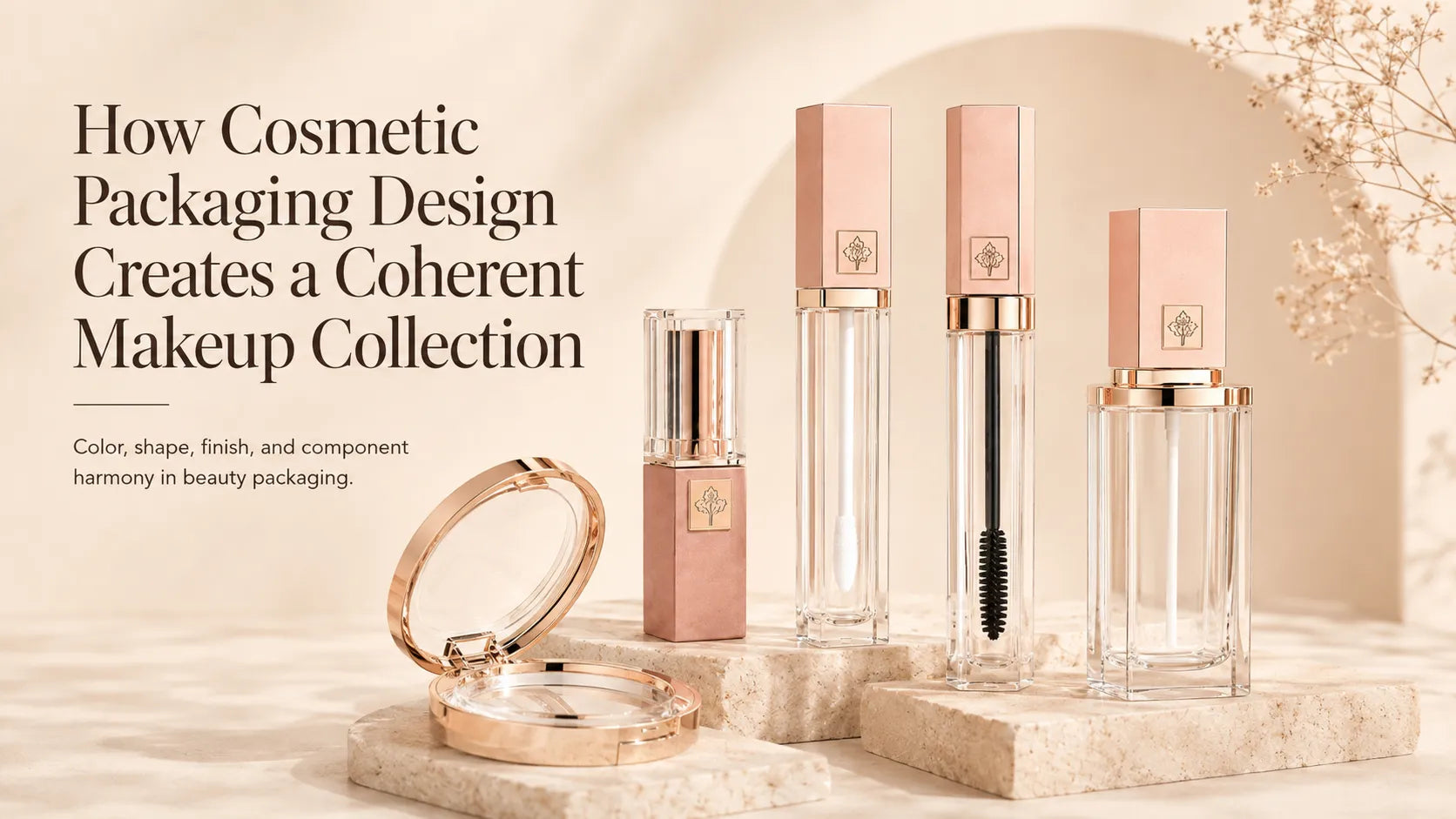
A coherent tube usually has one primary style signal and several supporting details. The silhouette may establish the first impression, while the material, color, finish, and logo reinforce it. A square black tube with a concise silver logo reads differently from a rounded pale-pink tube with a soft rose-gold accent even when both use the same mechanism.
Before collecting lipstick packaging ideas, define three points: the intended brand character, the product price position, and the role of the lipstick within the wider makeup line. This keeps the design from becoming a collection of attractive but unrelated effects.
2. Clean and Minimalist Style Uses Restraint as the Main Feature
Minimalist lipstick packaging often uses a clean round, slim, square, or rectangular profile with controlled decoration. White, black, beige, soft gray, transparent details, and muted brand colors can create a calm foundation. A small logo, precise edge, or single metallic line is usually more effective than filling the entire surface with artwork.

The material changes the mood within this style. Smooth plastic supports a light and modern result, aluminum adds a cooler and more refined feel, and a clean paper surface creates a softer material-led expression. Minimal does not mean unfinished; the quality is visible in proportion, alignment, color consistency, and the relationship between the cap and body.

3. Cool and Fashion-Led Style Expresses a Clear Attitude
Brands exploring cool lipstick containers often want the package to feel confident, current, and visually decisive. Sharp geometry, deep black, reflective silver, high-saturation color, strong two-tone contrast, and selected irregular details can create that attitude. Square or angular silhouettes feel more structured, while a clean elongated tube can appear sleek and editorial.

Successful cool lipstick tubes do not need every high-impact element at once. Vacuum metallization can create a fashion-forward reflective surface, high-gloss UV coating can intensify color and depth, and bold screen printing or hot stamping can establish a recognizable graphic focus. One dominant shape, contrast, or finish should lead the design.

4. Soft and Romantic Style Comes from Proportion as Much as Color
Pink and rose gold are common in romantic lipstick designs, but color alone does not create softness. Rounded edges, compact proportions, smooth transitions between components, delicate logos, and lower-contrast combinations all contribute to the result.

A pale-pink body with one rose-gold detail can feel refined and contemporary. A pearl-like surface, translucent outer shell, gentle gradient, or small decorative ring may add depth without making the package overly ornate. For a stronger gifting direction, a heart, flower, or jewel-inspired detail can become the focal point while the rest of the tube stays controlled.

5. Playful and Character-Led Style Makes the Package Instantly Recognizable
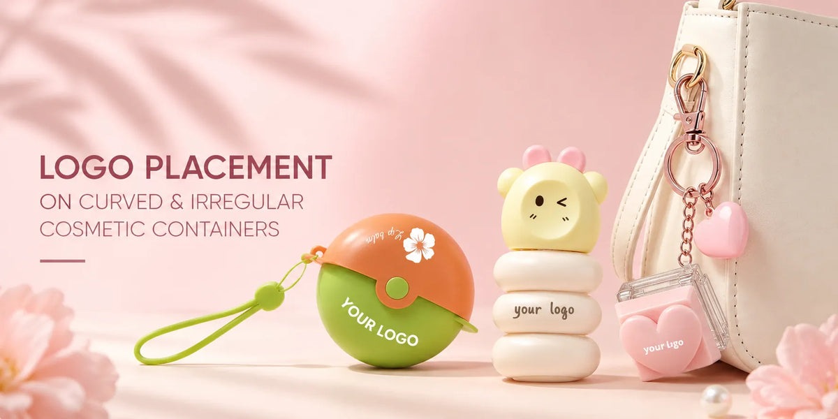
Cute lipstick tubes can use rounded miniature proportions, character caps, candy-inspired forms, paired-product cases, bright colors, and expressive artwork. The most convincing designs build the playful idea into the silhouette or component relationship instead of adding a cartoon print to an unrelated standard tube.

Cute lipstick containers can also use different colors to distinguish characters or shades within one collection, while heat-transfer graphics, three-dimensional details, and coordinated caps reinforce the theme. Buyers should first decide whether the product should feel youthful, collectible, giftable, or character-led because each direction needs a different balance of shape, color, and artwork.

6. Luxury Style Combines Material Presence with Controlled Decoration
A luxury lipstick tube usually feels considered before the logo is read. An aluminum shell can provide real metal weight and a cooler touch, while a well-finished plastic structure can use vacuum metallization or a high-gloss surface to create a polished metal-like appearance. Gold, rose gold, black, and silver are common directions because they give the package a strong visual base for premium positioning.

The decorative focus may come from a gemstone- or crown-inspired shape, a refined metallic logo, laser engraving, or selected rhinestone details. These elements work best when one feature leads and the remaining surfaces stay controlled. KAIYA can combine suitable lipstick tube structures with compatible colors, materials, and finishes for luxury cosmetic packaging projects.

7. Natural and Material-Led Style Lets the Surface Tell the Story
Paper-based lipstick tubes, kraft-like colors, restrained printing, botanical artwork, and warmer neutral tones can create a natural or ingredient-led appearance. In this style, the visible material and print surface are part of the design rather than a base that must be completely covered.

A paper tube can use full-color printing for a polished result or a quieter palette for a more understated identity. Buyers should still confirm the complete material composition and internal structure because a paper exterior does not mean that every component or mechanism is made from the same material.
8. Artistic and Sculptural Style Turns the Tube into a Statement Object
Innovative lipstick packaging often begins by changing the outline, proportion, cap, or way two components meet. Gemstone-inspired forms, crown caps, asymmetrical cases, dimensional reliefs, mirrored details, and unusual combinations can give the lipstick a stronger display and collection value.

This direction is useful when the brand wants unique lipstick packaging that remains recognizable without relying on a large logo. Existing decorative molds offer a more direct route, while a truly original silhouette requires separate appearance design, engineering, tooling, samples, MOQ, and development time. A distinctive concept should therefore be assessed as a complete structure rather than as a surface-decoration request.

9. Carry the Style Across a Complete Lipstick Collection
A collection does not need every SKU to look identical. It needs consistent rules. The tube shape and logo position may remain fixed while body color changes by shade family. Alternatively, the main color can stay consistent while a ring, cap detail, or printed pattern distinguishes products.
- Fixed elements: tube shape, material, mechanism, cap proportion, logo position, and main finish.
- Variable elements: shade color, accent ring, small graphic, cap color, or selected decorative detail.
- Collection check: place several finished samples together to confirm that the differences remain organized rather than random.
10. Translate the Style into a Usable Packaging Brief
A style name alone is not enough for sampling. “Modern,” “cute,” or “premium” can mean different things to different teams. A clearer brief separates the design into specific decisions:
- Shape and proportion: round, square, slim, compact, sculptural, or another confirmed form.
- Material: plastic, aluminum, paper, or a selected multi-material structure.
- Color direction: Pantone reference, transparency, metallic tone, gloss level, and component distribution.
- Surface process: spray coating, printing, hot stamping, metallization, UV coating, engraving, or compatible combinations.
- Logo and artwork: size, position, print colors, orientation, and relation to the cap and body.
- Development route: existing model, semi-custom decoration, or a separate new-mold project.
11. Develop a Distinct Lipstick Packaging Style with KAIYA
KAIYA develops lipstick packaging for clean, cool, romantic, playful, luxury, natural, and artistic product directions. Existing lipstick tubes can support confirmed colors, logos, materials, and compatible finishes, while original forms and structural concepts can be assessed through a separate custom packaging route.
Send the brand position, reference images, lipstick format, preferred shape, material, color, finish, logo artwork, target quantity, and launch schedule. KAIYA can help turn a broad style idea into a more specific lipstick packaging brief and development path.