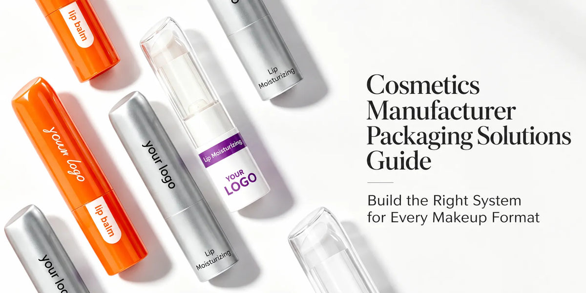
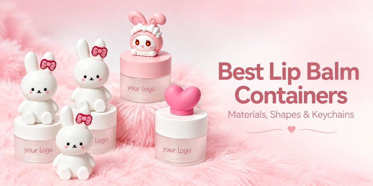
Colorful cosmetic packaging is most effective when every color has a defined job. One color may identify the brand, another may separate lip, eye, and face categories, and a smaller accent may distinguish individual shades. Without those roles, a bright collection can attract attention but still make the assortment difficult to understand.
This guide explains how beauty brands can turn color into a workable primary-packaging system. KAIYA helps buyers compare container structures, materials, color routes, transparency, finishes, logos, and physical samples so the final line remains expressive, category-correct, and practical to reproduce.

Quick overview:
- Assign color roles: separate brand color, category color, SKU code, and accent.
- Choose the color route: molded color, coating, printing, metallization, and real metal do not create the same result.
- Design for the material: the same target color changes across plastic, aluminum, paper, and selected glass.
- Use transparency deliberately: clear, translucent, and opaque structures communicate different product ideas.
- Approve physical standards: control color together with gloss, texture, logo, assembly, and repeat-order references.
1. Give Every Color a Clear Role Before Selecting Individual Tones
A useful color system normally has four layers. The brand base provides recognition across the collection. Category colors help customers distinguish lip, eye, and face products. SKU colors identify shades or formula variants. Accent colors create hierarchy around selected caps, collars, logos, or hero products. One color may perform more than one role, but the roles should be decided before samples begin.

Best starting point: build a simple product-and-color map. List each container, its category, its main color, the component that carries the color, and whether the choice remains fixed or changes by shade. This exposes conflicts early—for example, when the same colored cap is expected to identify both a product category and a shade.
KAIYA's cosmetic packaging by color range can help buyers compare visual directions, but the final selection should still follow the real structure and use of each package.
2. Select the Color-Creation Route, Not Only the Color Name
A color name does not define how the finished component will look. A plastic part may use molded-in color or a compatible spray coating. Logos and controlled color areas may use silk screen printing, pad printing, heat transfer printing, or other suitable decoration. Reflective metallic effects may use vacuum metallization on a compatible component, while an actual aluminum shell follows a different material and finishing route.

Molded color can be useful when the component itself should remain visibly colored through normal handling. Spray coating expands the choice of opaque, matte, satin, glossy, translucent, and selected tactile directions, but coating thickness and no-spray zones must be coordinated with threads, snap fits, hinges, and assembly surfaces.

Important distinction: a reflective gold plastic cap and a gold-colored aluminum cap may belong to one visual family, but they are not the same material or surface system. KAIYA compares the intended appearance, touch, component geometry, decoration sequence, and sample standard before recommending a route.
3. Expect the Same Target Color to Change Across Materials and Components
A digital color value or one physical swatch cannot guarantee that every component will look identical. Resin color, substrate opacity, wall thickness, surface texture, primer, coating build, and gloss all influence the result. Even two plastic parts can appear different when one is highly polished and the other is matte or textured.
The difference becomes more visible when a collection combines plastic tubes, aluminum shells, paper components, and selected glass bottles or care jars. KAIYA reviews the available cosmetic packaging materials and can help decide whether the goal should be a close visual match or an intentionally related family of tones.
The second route is often more realistic and more attractive. A warm pink may appear solid on a lipstick tube, softly translucent on a gloss body, and slightly muted on a compact lid. The colors remain connected because their hue relationship is controlled, even though their depth and gloss are allowed to suit each material.

4. Adapt the Color Map to Each Product Category
Lip containers can often carry stronger shade-led expression because color is already central to the product. A lip gloss range may keep one cap color while the transparent body shows the formula, or use colored bases or printed codes to identify shades. Lipstick and balm tubes can use a stable outer family with smaller shade identifiers when the full shell should remain consistent.

Eye products benefit from clear product recognition. Mascara, eyeliner, brow gel, and brow sticks may share one main brand color while using controlled bands, caps, or typography to separate functions. The colored element should not reduce the readability of the applicator-led category or make several slim tubes indistinguishable.
Face containers provide larger visual areas but also carry more structural variety. Foundation bottles, blush sticks, cushion compacts, powder cases, and palettes can share a color relationship without using identical coverage. A compact lid may carry the hero color, while a stick uses the same tone on the cap and a foundation bottle uses it only on the closure.
5. Decide Whether the Formula Should Participate in the Color Design
Clear and translucent components allow the filled formula to become part of the packaging palette. This is especially useful for visible lip oils, glosses, selected liquid face products, and other formulas where clarity and shade appearance support the selling point. The brand color can move to the cap, collar, logo, or a controlled tinted wall instead of hiding the product.

Opaque packaging creates a more stable exterior color block and can reduce visual variation caused by different formula shades. It is often useful when the line needs one strong brand surface, when the formula appearance is not a selling feature, or when the selected component and formula route call for greater visual coverage.

Translucent color sits between these two directions. A tinted clear body can create depth and softness, but the final appearance changes after filling. Buyers should therefore review both empty and filled samples rather than approving transparency from an empty component alone.

6. Control Color Through Gloss, Texture, and Metallic Effects
Color and finish should be approved together. Gloss makes a color appear deeper and more reflective; matte can make it feel softer or more restrained; textured and soft-touch surfaces change both light response and hand feel. A color selected from a flat paper card may therefore look very different on a curved glossy tube.
Metallic effects create an additional hierarchy.
- Hot stamping can add a localized metallic logo or detail;

- vacuum metallization can create a broader reflective metal-like surface on suitable components.

These routes should not automatically cover every SKU; using them on selected caps, collars, or hero products can make the hierarchy clearer.
Gradient, pearl, and other special coating directions may also be possible on selected projects, but the outcome depends on geometry, process compatibility, coverage, and physical approval. KAIYA treats these effects as sample-led developments rather than universal defaults.
7. Keep Logos and Product Information Readable Inside a Strong Color System
A colorful component still needs clear branding. Logo color, print opacity, line thickness, curvature, and viewing angle determine whether the mark remains readable. A low-contrast logo may disappear on a dark or translucent body, while a metallic logo can lose definition when it crosses a seam or highly curved area.

Silk screen printing can provide strong solid coverage on suitable flat or regularly cylindrical zones. Irregular surfaces may require a different decoration route or a smaller approved area. The artwork should be evaluated on the actual component instead of assuming that the same logo size and process can transfer unchanged from a compact lid to a narrow mascara tube.

The color system should also leave room for product names, shade identification, and legally required information according to the brand's market and secondary-label plan. Strong color is valuable only when the package remains easy to recognize and use.
8. Approve a Physical Color Standard for Production and Reorders
Screen images are useful for direction, but they are not sufficient production standards. A practical approval set records the physical color, material, gloss level, texture, transparency, logo, decoration position, and assembled appearance. When several components form one package, they should be approved together because adjacent color differences are easier to see after assembly.

Review samples under consistent lighting and from the angles customers will actually see. Compare broad flat areas, curved surfaces, edges, recesses, and moving contact zones. For a multi-SKU line, place the full family together so an individually acceptable component does not disrupt the collection.
Repeat orders should refer back to the signed or otherwise approved physical sample and recorded process route. If a material, supplier component, coating system, or artwork changes, the new result should be rechecked instead of relying only on the old color name.
9. Develop Colorful Cosmetic Packaging with KAIYA
KAIYA's primary-container range covers lip, eye, and face products in tube, bottle, stick, jar, compact, and palette formats. We can compare existing molds, coordinate component colors, review transparent and opaque routes, select compatible surface processes, place logos, prepare samples, and assess whether an original shape or component needs separate tooling through our custom cosmetic packaging service.

Send the planned products and formulas, shade count, target market, preferred formats, physical or visual color references, artwork, surface-effect direction, expected quantities, and the intended hero SKUs. KAIYA can then turn the visual idea into a structured color brief and a practical sampling route.