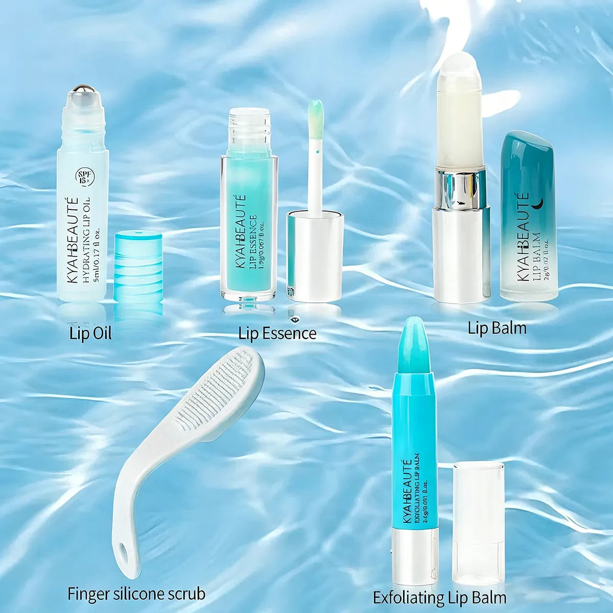
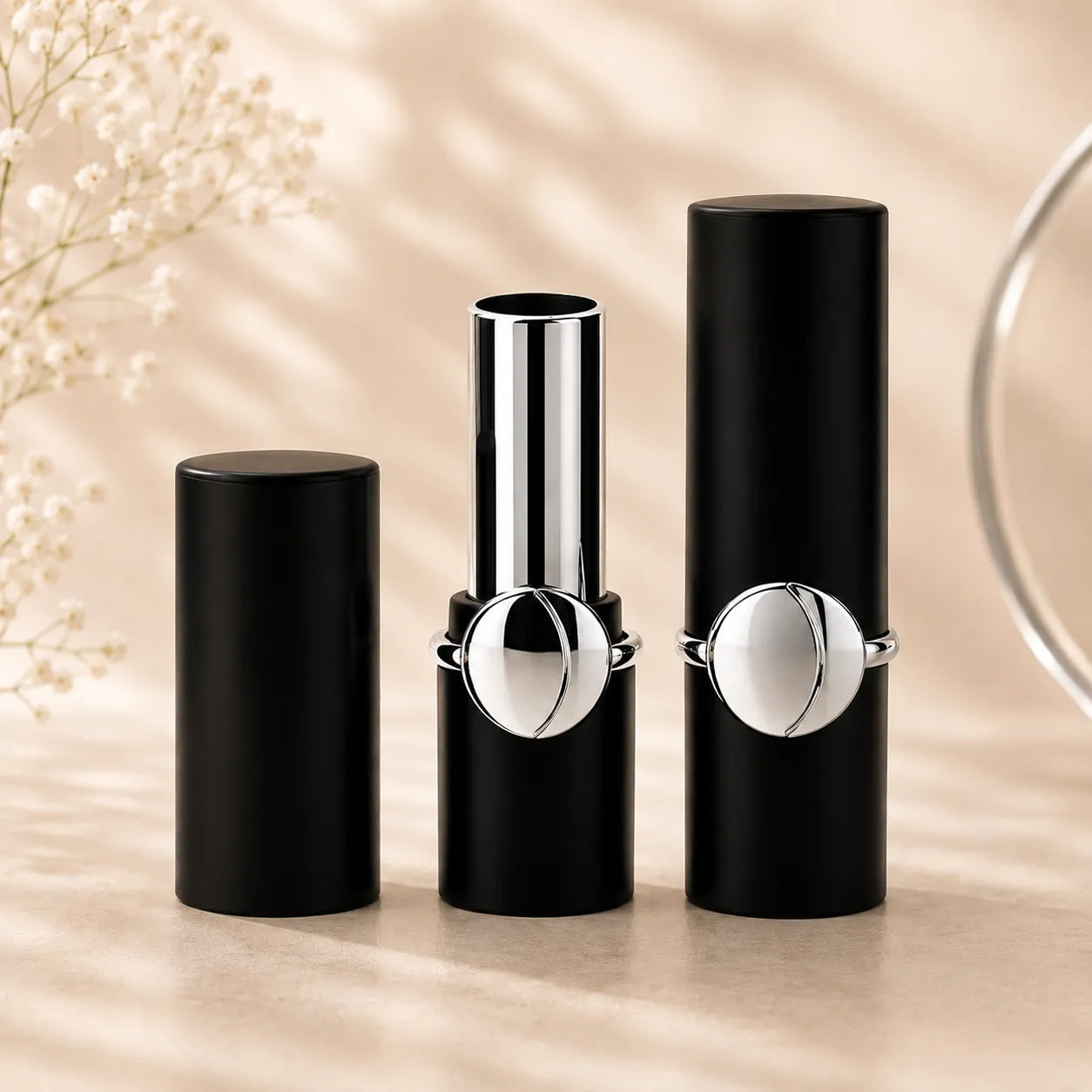
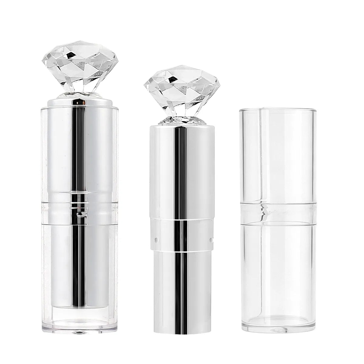
Color Cosmetic Packaging
Kaiya develops color cosmetic packaging for lip, eye, face, and nail categories, with coordinated options for tubes, bottles, sticks, and compact formats.
For many makeup brands, color is not simply a finishing choice. It helps define how a collection is recognized, how separate SKUs relate to each other, and how a launch feels planned rather than pieced together. This is why many buyers begin with one direction in colorful cosmetic packaging and then extend that idea across several product categories instead of sourcing each component as an isolated item.
In practical product development, color also has to work across different shapes and usage habits. A tone that feels right on a lip gloss tube may look more playful on a mascara bottle, more polished on a lipstick shell, or more decorative on a compact. At Kaiya, we help customers think about color as a system, whether the starting point is colored lip balm tubes, colored lip gloss tubes, or a broader family of colorful lip balm containers. That makes it easier to build a same-tone line without losing clarity from one item to the next.
Custom Color Coordination for Makeup Series
Some brands need one signature item, while others need a full same-color collection across several product groups. Kaiya supports both approaches. We can help align color direction across gloss, balm, mascara, lipstick, brow, stick, and compact packaging, while also considering finish, decoration, and category fit. This is especially useful for customers developing launch families where packaging needs to feel connected across multiple SKUs instead of repeating the same visual formula without structure.

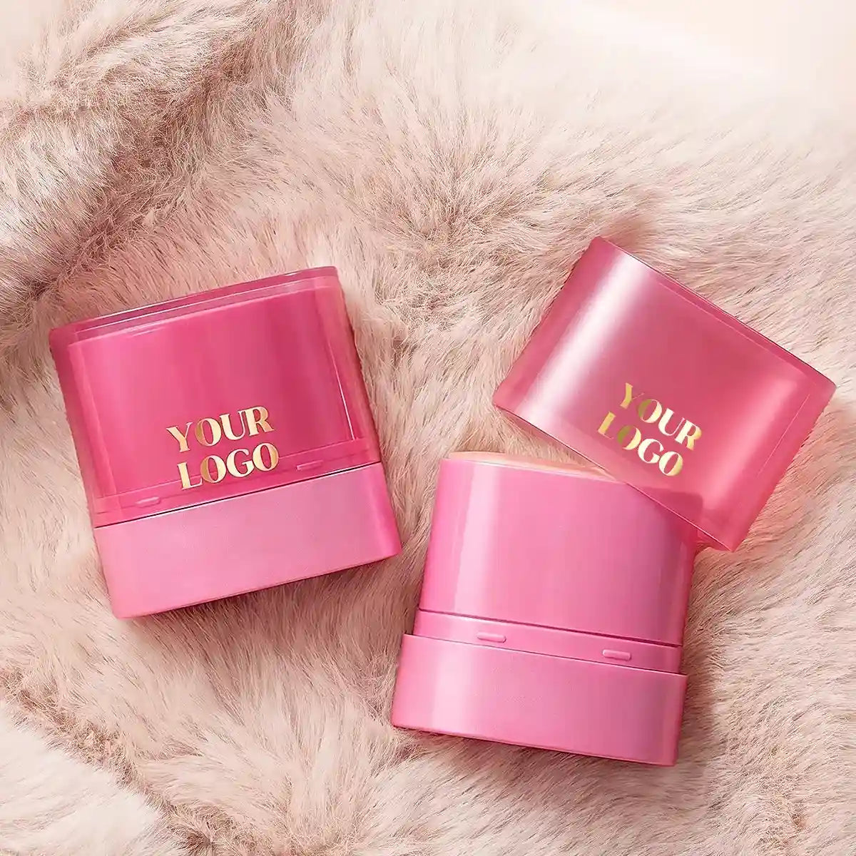
Pink Makeup Packaging
Pink makeup packaging is one of the most flexible directions in color cosmetics because it can move between soft, playful, trend-led, gift-ready, and collection-driven product concepts without narrowing the line to one fixed mood. In lip products, eye products, and selected face items, pink can help create a friendlier first impression while still leaving room for different finishes, from clean glossy surfaces to softer matte effects.
At Kaiya, we often see pink used not only for one hero item, but for full pink cosmetic packaging programs where several product types are expected to stay visually related. That is also why pink cosmetic containers are often developed as part of a coordinated series rather than as standalone packaging choices.

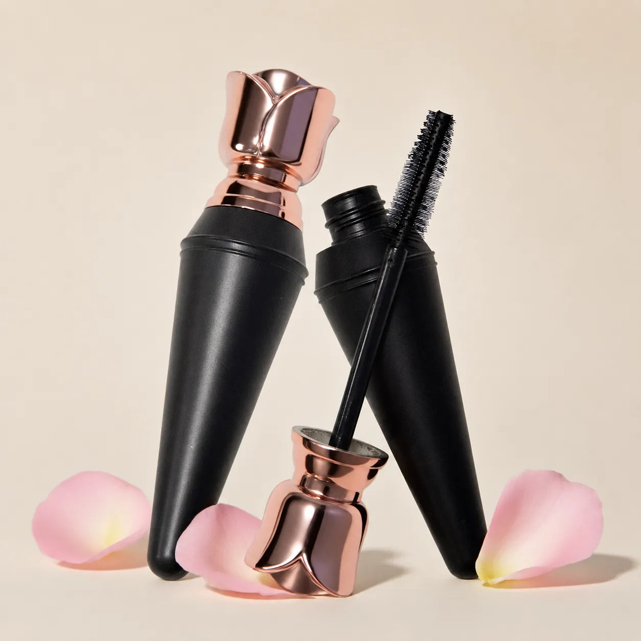
Pink Mascara Packaging
A pink mascara bottle is often chosen when the eye category needs to feel more expressive than a standard neutral range. For some projects, the packaging is expected to look bright and playful, while for others it should stay lighter and softer. Kaiya can support both directions, including a hot pink mascara bottle for stronger contrast or a light pink mascara bottle for a gentler pastel result.

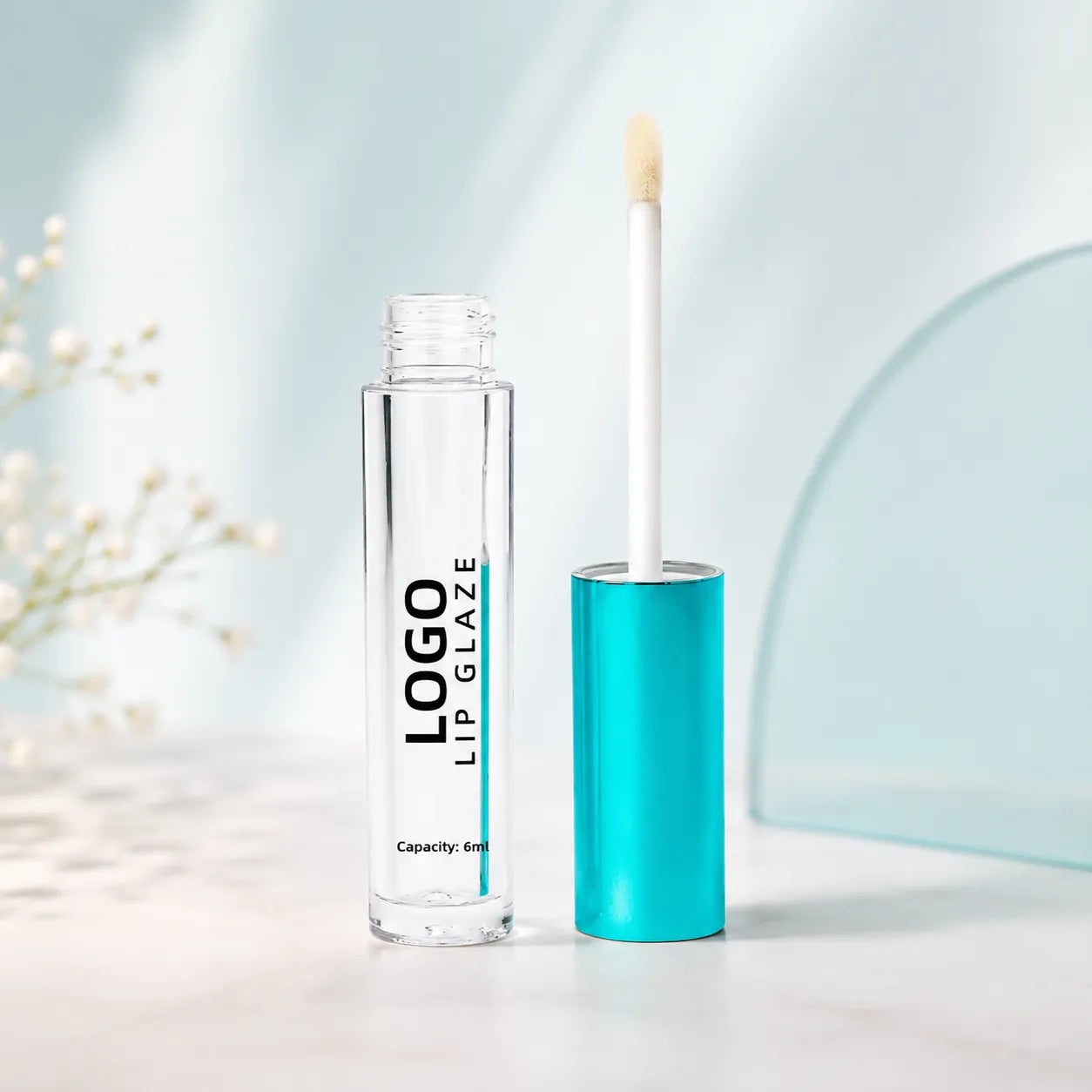
Pink Lip Gloss Packaging
For gloss ranges, pink lip gloss packaging works well when the product line is meant to feel coordinated, cheerful, and easy to group into sets. Kaiya develops pink lip gloss tubes and other gloss formats with attention to how the color reads on slimmer, rounder, or softer-squeeze structures. That makes the packaging more usable as part of a series instead of only as a single visual accent.
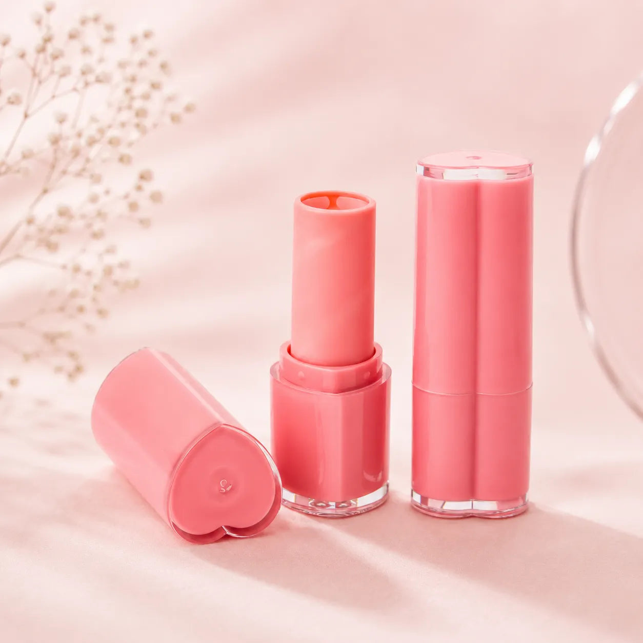
Pink Lip Balm Packaging
In balm categories, pink lip balm containers usually give the line a more approachable and gift-friendly character. This is especially useful when the balm range needs to sit naturally beside gloss or lipstick instead of looking like a separate category. At Kaiya, pink balm development is often handled as part of a broader color family so the final range feels consistent across several lip products.

Eyeliner Pink Packaging
A pink eyeliner tube can make eye makeup packaging feel softer, more playful, and easier to coordinate with related beauty products. Compared with black or silver eyeliner packaging, pink gives the product a lighter visual tone while still keeping the tube clean and practical. Kaiya can support pink eyeliner tube projects with matching caps, slim structures, logo printing, and finish options for brands building a more recognizable color theme.
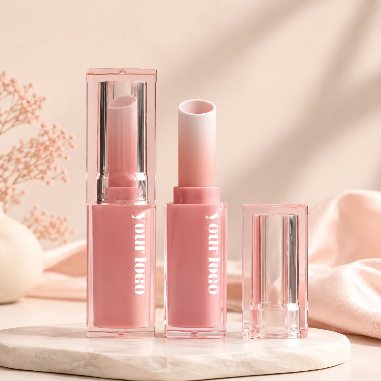
Pink Lipstick Packaging
A pink lipstick tube can help keep the color story continuous while still allowing the lipstick category to feel more defined than gloss or balm. For brands that need a slightly more structured closure style, Kaiya can also support pink lipstick packaging with more decorative or more premium-feeling shell options. The goal is to keep the lipstick visually aligned with the range without making every item look the same.

Pink Foundation Packaging
In complexion products, foundation pink packaging is useful when the face category needs to stay inside the same softer family as lip or eye items. A foundation pink bottle can help make that connection clearer, especially in collections where the packaging itself is part of the overall brand tone. Kaiya usually approaches this category carefully so the pink direction supports the face line without making it feel too novelty-led.

Pink Blush Packaging
Pink blush packaging works naturally for face makeup because the color already connects with soft, fresh, and healthy-looking beauty concepts. It can be used for blush sticks, cream blush compacts, liquid blush tubes, or small face makeup containers, depending on the formula type. Kaiya can help brands develop pink packaging across different blush formats, making the product line feel coordinated without relying on heavy decorative details.

Pink Nail Polish Packaging
A pink nail polish bottle can add a cheerful, more collectible feel to a nail range without requiring heavy decoration. In mixed makeup sets, pink nail packaging also helps the nail category relate more naturally to matching gloss, balm, or mascara items. Kaiya can support this kind of coordination when the project needs one recognizable pink theme across multiple small-format products.
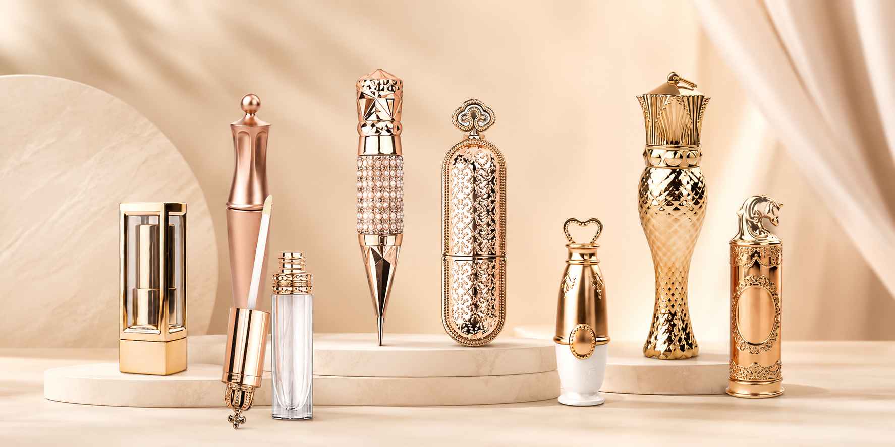
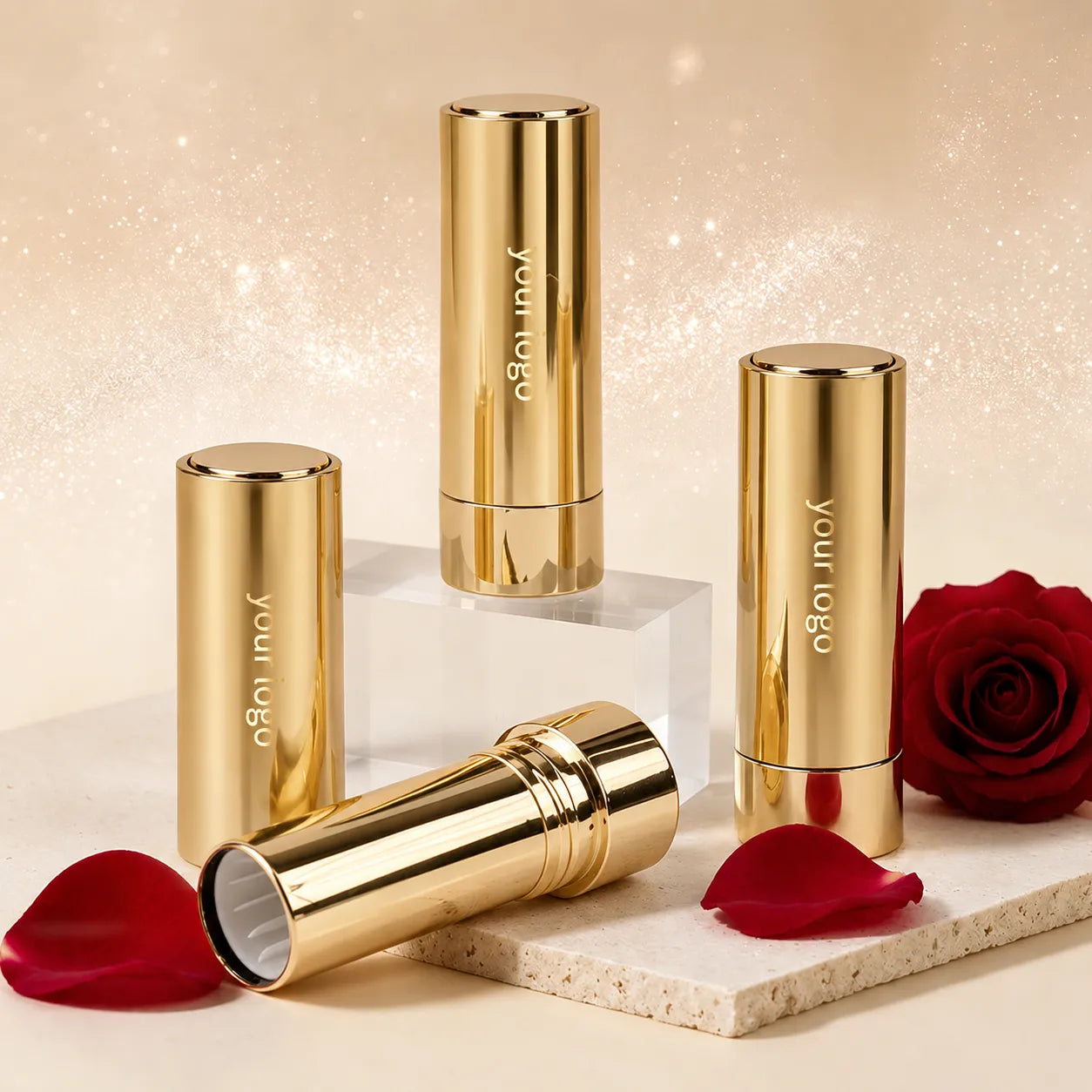
Gold Cosmetic Packaging
Gold cosmetic packaging usually works best when a brand wants more reflectivity, more structure, or a stronger metallic identity across a product line. Unlike softer color families, gold tends to create a clearer visual signal, which is why it is often used on key SKUs that carry the main look of the collection.
At Kaiya, gold development is less about using one bright metallic tone everywhere and more about deciding where gold should act as the main statement and where it should remain a controlled accent. This makes gold makeup packaging more practical for B2B projects that need consistency across lip, eye, and stick formats without turning the line into one repetitive metallic block.

Gold Lipstick Packaging
A gold lipstick tube is one of the clearest ways to give a lipstick line a more formal or more metallic packaging direction. In some projects, the lipstick shell is expected to carry most of the collection’s visual weight, which is why Kaiya also supports broader gold lipstick packaging programs when buyers want the lipstick family to define the range. The main task is to keep the gold finish strong without making it feel too heavy or too yellow.

Gold Mascara Packaging
A gold mascara bottle can help connect mascara with lipstick or gloss packaging when the brand wants one metallic language running through several categories. Compared with darker or brighter body colors, gold tends to make mascara feel more deliberate and more collection-led. Kaiya uses that direction when the buyer wants eye products to sit clearly inside a coordinated metallic family.

Gold Lip Balm Packaging
Gold lip balm containers can help lip care products feel more polished while staying easy to coordinate with lipstick, gloss, or compact packaging in the same collection. Compared with soft pastel or clear packaging, gold gives balm products a warmer and more gift-ready appearance. Kaiya can support gold lip balm tubes when brands want a metallic color direction that works across daily lip care, seasonal sets, or premium-looking lip product lines.
Gold Lip Gloss Packaging
For gloss products, gold lip gloss containers are a practical choice when the line needs a more metallic look while still staying easy to coordinate across sets, travel formats, or compact assortments. Kaiya can also support smaller gloss options, including 4ml formats, when the product range needs flexible sizing for different launch plans. In these projects, the gloss category usually works best when the gold finish strengthens the overall series without becoming too visually dominant.

Gold Stick Packaging
Stick formats can also carry metallic color effectively when the line needs more structure in face products. Blush stick gold packaging works well when the blush category needs a stronger packaging presence, while contour stick gold packaging is useful when the range calls for a sharper, more sculpted product identity. Kaiya can help keep those stick items aligned with the rest of the gold packaging family.
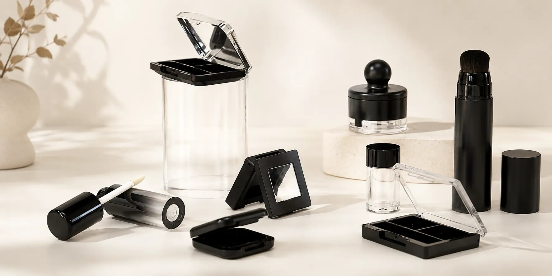
Black Cosmetic Packaging
Black cosmetic packaging remains one of the most dependable directions for brands that want a controlled, high-contrast, and highly adaptable packaging system. Black can feel minimal, more professional, more decorative, or more premium depending on the finish and shape around it, which is why it continues to work across very different makeup categories.
At Kaiya, black is often used when the customer wants a stable base color that can support future line extensions without requiring a redesign of the whole collection. This also makes black makeup packaging especially practical for projects that may later add foil, metallic accents, or stronger logo contrast while keeping the overall structure intact.
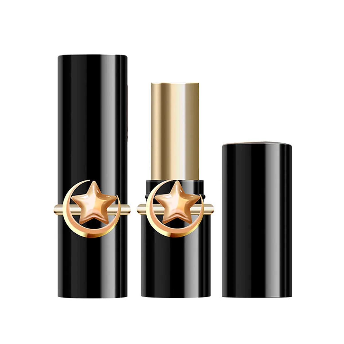
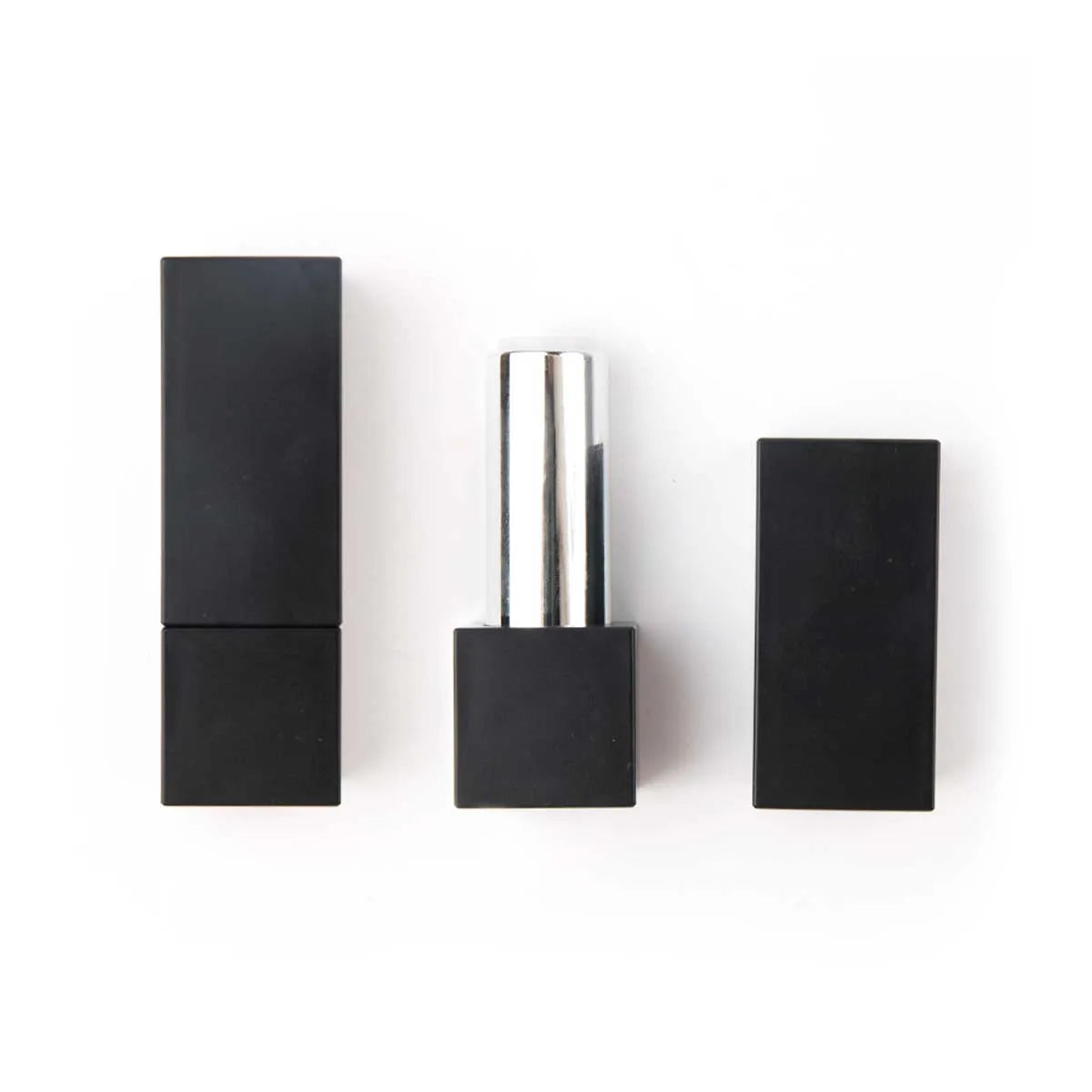
Black Lipstick Packaging
In lipstick, black lipstick containers offer a clear and stable base for brands that want the product family to look direct and organized. This direction works well across several shapes because black can appear classic on round shells and sharper on more geometric forms. Kaiya uses black lipstick development when the goal is to create a strong core packaging language that can stay useful over time.
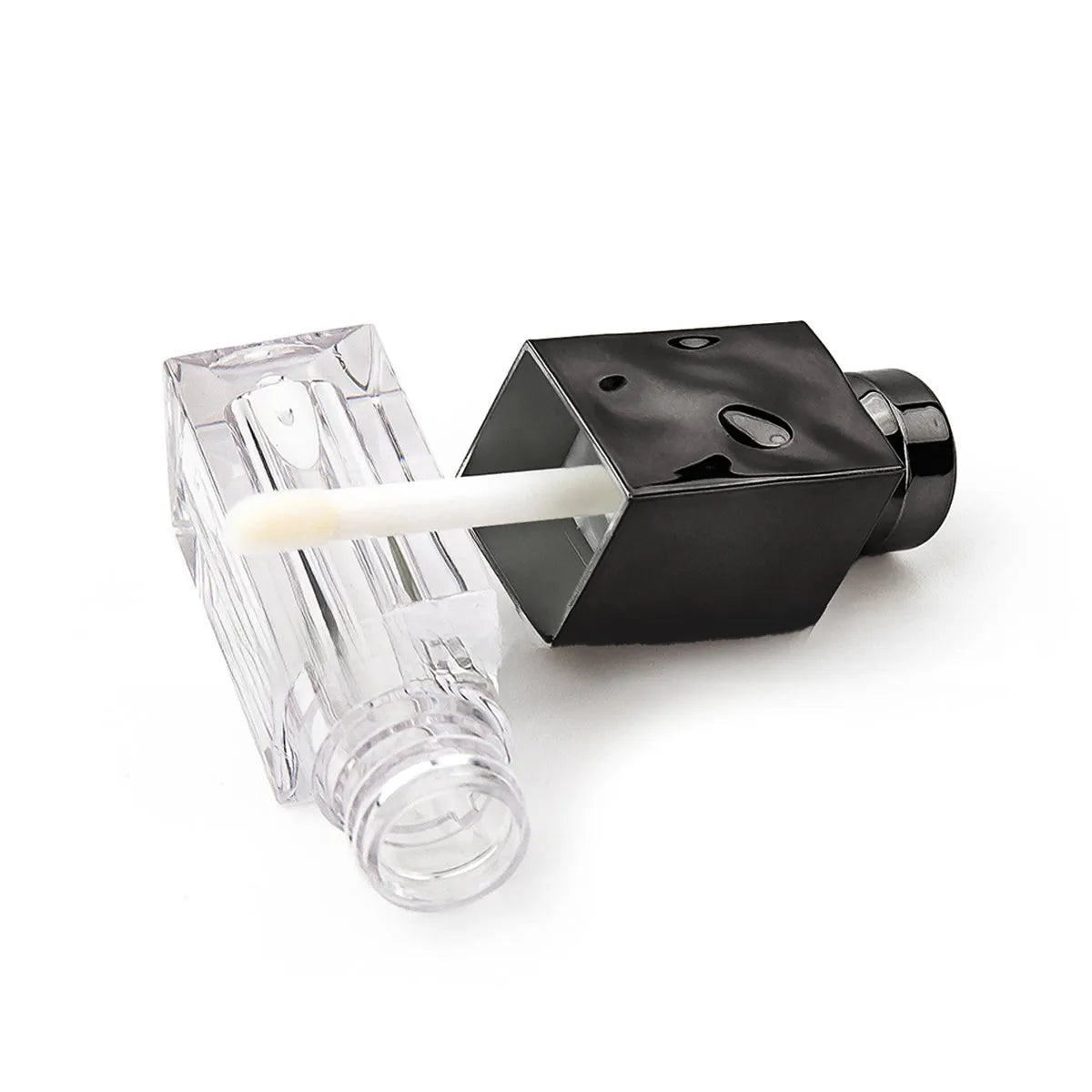
Black Lip Gloss Tubes
For gloss lines, black lip gloss containers help shift more visual attention toward the formula shade, print color, or cap detail rather than the body color alone. This makes black a good option when the lip range needs to stay visually disciplined while still allowing individual SKUs to feel distinct. Kaiya often recommends this route when customers want gloss packaging that remains easy to coordinate with lipstick or mascara.
Black Lip Balm Packaging
In balm ranges, black lip balm containers are often used when the brand wants balm to sit naturally beside the rest of a mature makeup collection instead of looking too playful. Compared with lighter body colors, black creates a more grounded packaging tone. Kaiya can support this approach when the customer wants the balm category to remain simple, stable, and easy to extend.
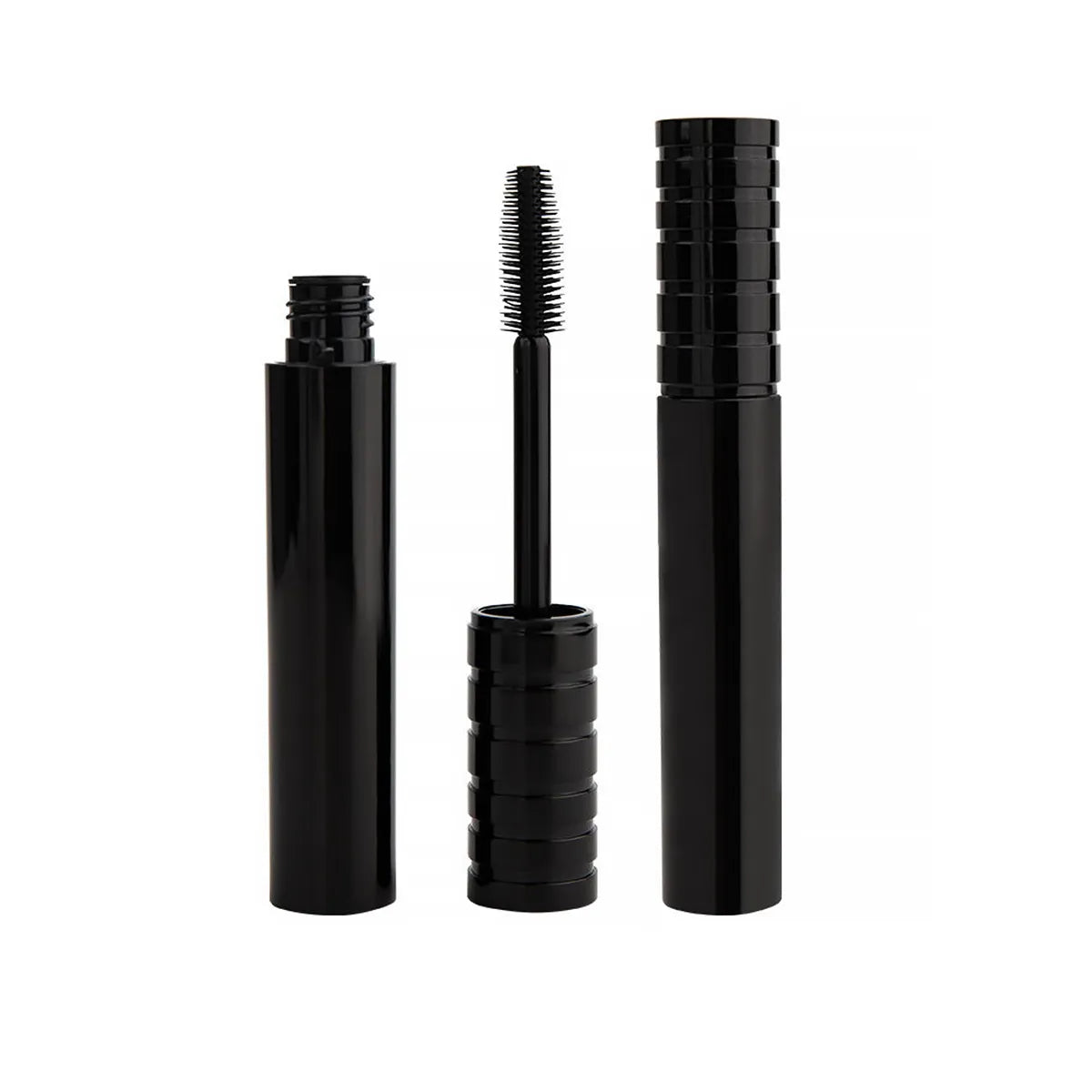
Black Mascara Packaging
A black mascara bottle remains a practical option when the eye category needs to stay compatible with the rest of the line without demanding too much decoration. It works well as a default structure in both minimalist and mixed-finish ranges. Kaiya often uses black mascara packaging as a dependable anchor when the customer wants the eye category to stay visually easy to manage.
Matte Black Cosmetic Packaging
When the line needs a quieter finish, matte black cosmetic containers can be more effective than reflective black surfaces. Matte black usually reduces glare and keeps the collection looking more restrained, which is useful for brands that want the packaging to feel serious rather than overly decorative. Kaiya often sees this finish chosen for product families where clarity and consistency matter more than shine.

White Makeup Packaging
White makeup packaging is often used when a brand wants the collection to feel cleaner, lighter, and more open from the first impression. Unlike stronger metallic or darker color directions, white creates more visual space around the product, which makes it especially useful for lines that rely on logo contrast, simple decoration, or a softer brand tone.
At Kaiya, white is not treated as a plain default color. It works best when the collection needs calm structure, better category consistency, and a surface that can support both minimal and more detailed decoration without making the line look heavy. This is why white cosmetic packaging is often a practical choice for brands building coordinated lipstick, eye, and face packaging families.
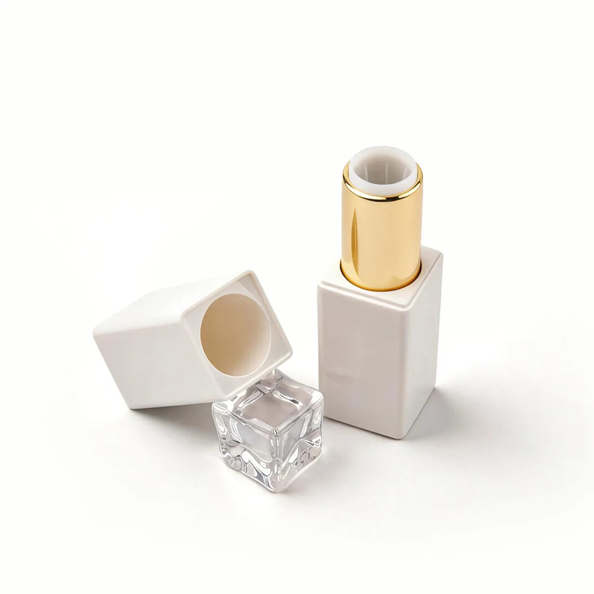
White Lipstick Packaging
In lipstick development, white lipstick packaging can make the product feel clean, neat, and more contemporary than darker shells or stronger metallic finishes. It works particularly well when the brand wants the lipstick category to look refined without becoming too formal. At Kaiya, white lipstick packaging is often used in collections where the container should stay visually light while still matching the rest of the series in a clear and consistent way.
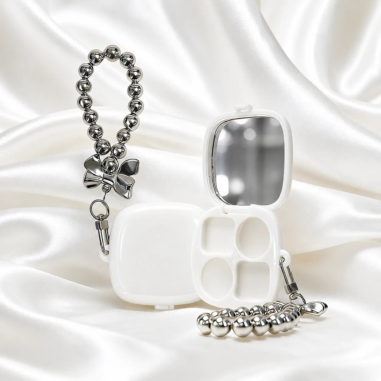
White Eyeshadow Palette Packaging
A white empty eyeshadow palette is useful when face and eye products need a simpler base color that can work across several SKUs without looking crowded. White palettes usually give more room for logo printing, outer decoration, or collection graphics, which makes them suitable for brands that want flexibility in how the range is presented. Kaiya often recommends this direction when the palette needs to stay easy to coordinate with lipstick, mascara, or other compact formats in the same line.
White Lip Balm Containers
White packaging can give lip care products a clean, soft, and practical look without making the design feel too decorative. This color works well for daily-use balm lines, minimal collections, or products that need to coordinate with white lipstick, gloss, or skincare-style packaging. Kaiya can support white empty lip balm tubes when brands want a lighter visual direction that still feels neat and easy to match across a series.
White Mascara Packaging
For eye products, a white mascara tube can help the mascara category feel fresher and more visible inside a lighter packaging family. Compared with darker body colors, white usually creates a cleaner look and can make decorative details stand out more clearly. At Kaiya, this type of mascara packaging is often developed for collections where the eye products need to stay aligned with white lipstick or compact packaging rather than shifting into a separate color direction.
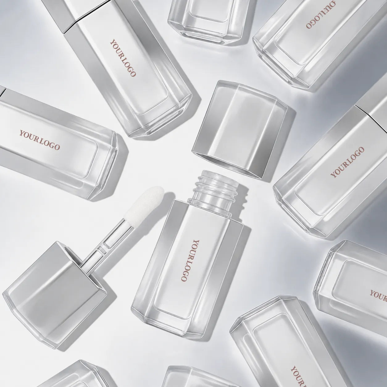
White Lip Gloss Tubes
White packaging can make gloss products feel fresh, simple, and more refined than stronger color shells. It is especially useful when a brand wants the gloss line to look clean while allowing the applicator, logo, or cap detail to carry the main design focus. Kaiya can develop white lip gloss containers for brands building soft, minimal, or coordinated lip product collections.
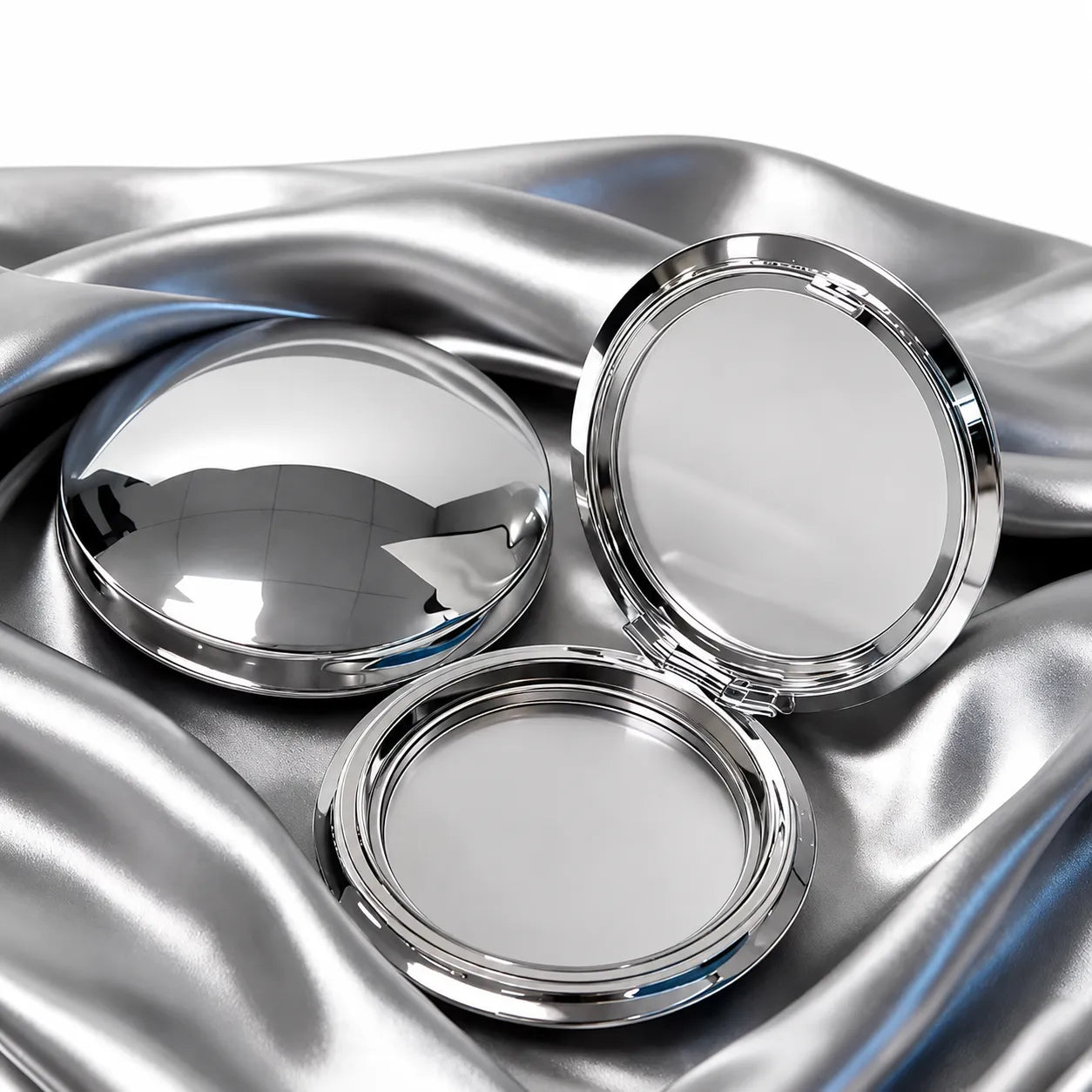
Silver Makeup Packaging
Silver makeup packaging usually suits brands that prefer a cooler metallic direction and a cleaner overall presentation than gold or rose gold. It often works well in product lines that rely on slim tubes, compact formats, or sharper category separation, because silver can make the range feel crisp without becoming overly decorative.
At Kaiya, silver is often used when customers want a metallic finish that feels controlled, modern, and easy to coordinate across lip, brow, face, and stick packaging. That is why silver makeup packaging is often more effective when it is planned as a selective collection language rather than applied too broadly without distinction.
Silver Lip Gloss Tubes
Silver lip gloss tubes can give gloss packaging a cleaner and more polished appearance without making the product feel overly decorative. Compared with soft pink or transparent styles, silver works well when a brand wants a cooler, more modern visual direction. Kaiya can support silver finishes for gloss tubes with matching caps, logo decoration, and applicator structures for coordinated lip product lines.
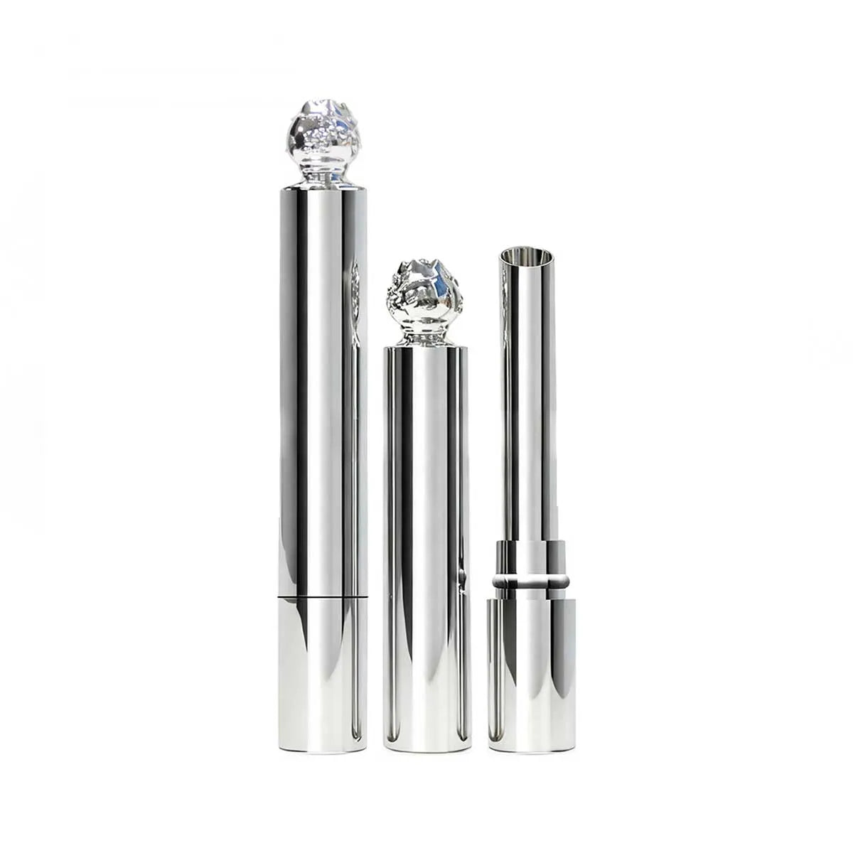
Silver Lipstick Tube
A silver lipstick tube can make lipstick packaging feel sleek, clean, and more contemporary than heavier gold or strong color shells. It works especially well for brands that want a neutral metallic direction across multiple shades or lipstick series. Kaiya can support silver lipstick tube projects with different shapes, finishes, logo decoration, and matching outer components.
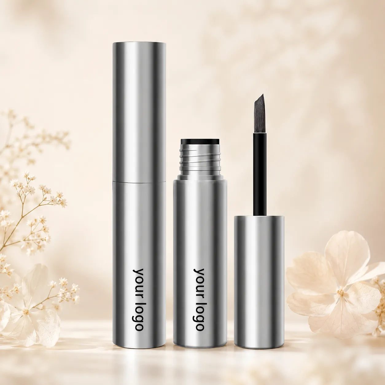
Eyebrow Gel Silver Tube
An eyebrow gel silver bottle can help brow packaging look sharper and more professional while keeping the overall design simple. Silver works well for eyebrow gel, brow wax, or grooming products that need a clean metallic look without feeling too heavy. Kaiya can support this direction with suitable tube structures, brush options, and surface finishes for coordinated brow product lines.
Silver Lip Balm Tubes
Silver lip balm tubes are suitable for lip care lines that want a simple, refined, and slightly more premium look. The metallic tone can make daily-use balm packaging feel more structured while still staying easy to match with lipstick, gloss, or skincare-style products. Kaiya can develop silver balm tube options for brands building clean, gift-ready, or collection-based lip care packaging.
Rose Gold Makeup Packaging
rose gold cosmetic containers is often selected when a brand wants metallic packaging with a warmer and softer tone than standard gold. It sits in a useful middle position: more refined than flat pink, but not as strong or as bright as yellow gold. That balance is why rose gold works especially well in categories where the packaging needs to feel polished without becoming too formal. At Kaiya, rose gold projects are usually developed for brands that want a metallic family with a gentler color temperature and a clearer sense of cohesion across lip and eye products.
Rose Gold Lipstick Packaging
Among metallic lip categories, rose gold lipstick packaging is often the most natural application because lipstick shells carry surface color so directly. A rose gold lipstick tube can make the product feel warmer and more dressed than a neutral shell while still remaining easier to coordinate than a very bright metallic. Kaiya uses this direction when the lipstick family is expected to anchor the visual tone of the range.
Rose Gold Mascara Packaging
A rose gold mascara bottle can extend that same warmer metallic identity into the eye category without breaking the overall series. This is particularly helpful when the customer wants lip and eye products to share one color language rather than split into unrelated visual groups. Kaiya can support that type of coordinated development so the finished range feels connected from the first sample stage.
Rose Gold Compact Packaging
For face products, rose gold cosmetic packaging can work especially well on compact formats when the collection needs a warmer metallic touch without looking too strong. A rose gold compact helps powder products feel more coordinated with matching lipstick or mascara packaging while still keeping their own category presence.
Red Makeup Packaging
Red makeup packaging usually creates a more immediate visual statement than neutral or metallic directions, so it tends to work best when the brand wants a stronger campaign color, a seasonal idea, or a defined hero category. Red carries more visual energy, but it also needs tighter control because small shifts in undertone can quickly change the character of the whole line.
At Kaiya, this color direction is most effective when it is planned with a clear role inside the collection, whether as a standout lip category, a focused eye item, or a limited launch theme, rather than being spread too broadly across every SKU without distinction.
Red Lipstick Packaging
A red lipstick tube can give the lipstick category a more direct presence, especially when the collection needs one product group to feel more iconic. This direction is useful for concept-driven launches, festive assortments, or color-led lines where lipstick is expected to carry a clearer visual message. At Kaiya, we develop red lipstick packaging when the brand wants the lipstick family to feel confident, coordinated, and distinct without making the range look overly uniform.
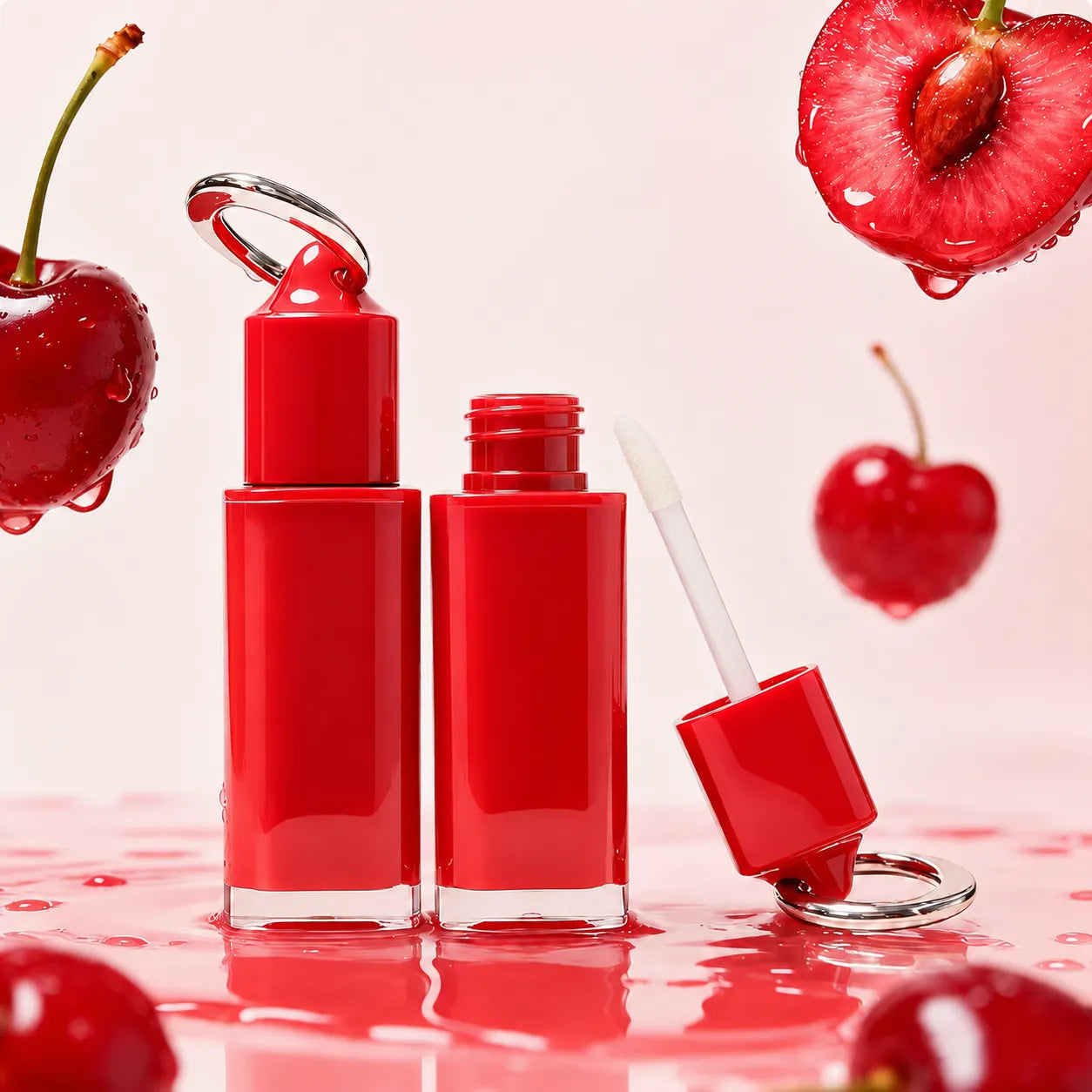
Red Lip Gloss Packaging
In lip products, a red lip gloss tube can carry that same stronger color identity into the gloss category without forcing every related item to follow the exact same packaging tone. This helps the lip range stay linked to the campaign while leaving enough room for softer or more neutral items elsewhere in the collection. At Kaiya, red gloss packaging is usually most effective when it works as a concentrated highlight rather than the default body color across the full line.
Red Mascara Packaging
A red mascara bottle is useful when the eye category is expected to show more energy and stronger visual contrast than the rest of the range. It often suits seasonal programs, campaign-led collections, or themed launches where mascara needs to stand out quickly without relying on heavy decoration. At Kaiya, we use this direction when the packaging should feel bold and noticeable while still remaining workable within a broader commercial series.
Blue Makeup Packaging
Blue makeup packaging is a useful direction when a brand wants the collection to feel cooler, fresher, or more visually distinctive than neutral packaging without moving into metallic finishes. Blue can read clean, playful, modern, or more concept-led depending on the tone, which makes it suitable for selected lip and eye categories as well as smaller-format items. At Kaiya, blue is often developed for customers who want a recognizable color family that stands apart from pink, black, or gold while still remaining workable across different component types. This is why blue makeup packaging and blue cosmetic packaging can be effective when the goal is to create a color-led range with a clearer identity rather than a purely decorative accent.
Mascara Blue Packaging
In eye products, blue mascara packaging can give the category a fresher and more expressive presence than standard neutral packaging. A light blue mascara bottle is especially useful when the line needs a softer or cleaner look, while stronger blue tones can make mascara feel more concept-driven and more noticeable inside a wider collection. At Kaiya, blue mascara development is usually handled with attention to how the tone supports the eye category without making the overall range feel disconnected.
Lip Balm Blue Container
For balm categories, a lip balm blue container can help the product feel clearer, calmer, and more visually distinct from warmer lip packaging directions. This is often useful when the balm line should stay recognizable on its own but still coordinate with matching eye or gloss packaging. At Kaiya, we use blue balm packaging when the collection needs a cooler color story that remains easy to repeat across multiple lip items.
Blue Lip Gloss Tubes
In gloss products, a blue lip gloss tube can introduce a stronger color identity without requiring heavy decoration or more complex surface effects. This works well for collections that need a cooler visual tone or a more playful contrast against softer lip categories. At Kaiya, blue gloss packaging is often developed for brands that want the gloss family to feel coordinated, noticeable, and easy to integrate into a broader color-led makeup line.
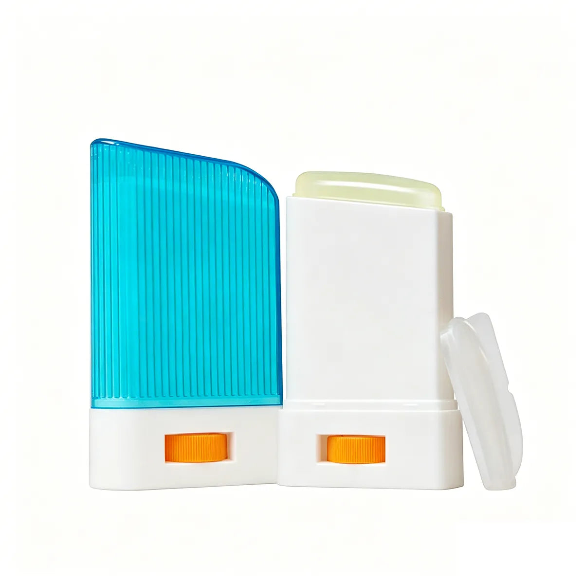
Sunscreen Blue Packaging
Sunscreen blue packaging gives SPF products a clean, fresh, outdoor-ready look for daily protection, water activities, or summer travel. Compared with pink or yellow packaging, blue feels cooler and more functional, making it suitable for sunscreen tubes, sticks, bottles, or compacts. Kaiya can support this color direction when brands want sunscreen packaging that looks recognizable and easy to coordinate with seasonal SPF collections.
Green Makeup Packaging
Green makeup packaging is usually more selective than pink, black, or gold, but it can be very effective when the brand wants a cooler, more concept-led, or more character-driven packaging direction. In makeup, green can feel fresh, graphic, modern, or more distinctive depending on the shade and the product category it is paired with. At Kaiya, green is often better used with intention rather than spread broadly across every SKU, especially because some categories carry green more naturally than others. This makes green makeup packaging and green cosmetic packaging most useful when the color is planned around a few clear product groups instead of being treated as a default finish across the whole collection.
Green Mascara Packaging
A green mascara tube is one of the more natural applications for this color family because the eye category can carry stronger or more directional packaging more easily than some other product types. Green mascara packaging often works well when the line needs a sharper concept, a cleaner color contrast, or a more visible hero item within the range. At Kaiya, we use this direction when customers want eye packaging to feel distinctive while still staying commercially workable in a broader series.

Green Blush Packaging
For face products, blush green packaging can be useful when the blush category is expected to stand apart visually without relying on metallic decoration. Green works best here when the tone is chosen carefully so the compact or blush component feels intentional rather than random. At Kaiya, we usually approach green blush packaging as part of a focused color story, helping the face category stay coordinated with the rest of the line while still keeping its own identity.
Green Sunscreen Packaging
Green sunscreen packaging can give sunscreen stick products a fresh, natural, and outdoor-friendly look for daily SPF, summer travel, or plant-inspired collections. Compared with blue packaging, green feels softer and more lifestyle-oriented while still keeping a clean protective impression. Kaiya can support this color direction for sunscreen stick containers when brands want packaging that looks recognizable, easy to carry, and suitable for seasonal SPF product lines.
Other Color Options for Special Programs
Not every project has to stay inside one of these main color families above. Some customers need a cleaner neutral look, while others want a brighter seasonal idea or a two-tone combination that gives the line more contrast. Kaiya also supports selected additional directions when the collection strategy calls for them.
For shorter runs, seasonal launches, or more playful themes, yellow packaged makeup can add a brighter packaging mood without requiring the full range to shift in the same direction. Kaiya can also support mixed systems such as black and gold cosmetic packaging or white and gold cosmetic packaging when the customer wants one stable base color with one controlled accent. This approach is often useful when the line needs contrast without becoming visually fragmented.
Why Buyers Use Kaiya for Color Packaging Projects
Color-led makeup packaging projects usually become more complex once they move beyond one sample item. A tone that looks right on a gloss tube may appear different on a mascara bottle, a lipstick shell, or a compact lid. Kaiya helps customers manage that transition by developing color together with finish, shape, and category role. That makes it easier to build a product family that feels connected without forcing every item into the same expression.
For B2B buyers, this is often the real value of working with Kaiya. We do not only help source a colored component. We help customers decide how a color direction should behave across a full range, where the strongest statement should sit, which categories should stay quieter, and how the final line can remain clear from one product type to another.
Explore More Makeup Packaging Options
Blush Packaging
Lipstick Packaging
Mascara Packaging
Powder Compact Case
FAQ
Packaging Solutions
- The best starting point is usually one anchor item and one supporting item, rather than trying to approve the whole line at once.
- For example, a brand may begin with pink makeup packaging in mascara and gloss, then extend that tone into balm or face products after the first direction is confirmed.
- Kaiya usually helps customers define which items should set the tone and which items should follow it more quietly.
- The main difference is not only color temperature, but also how the packaging feels in use.
- Pink cosmetic packaging usually reads softer and more playful, while rose gold makeup packaging brings in a metallic effect that feels warmer and more dressed.
- Kaiya often recommends comparing both directions across at least two product categories before locking the full series.
- Gold is usually the better option when the collection needs more warmth, reflectivity, or a stronger accent on hero products.
- Gold cosmetic packaging often suits lipstick-led lines, while silver makeup packaging tends to work better when the range needs a cooler and more controlled tone.
- At Kaiya, the choice is usually made by looking at the role of the packaging inside the full line, not the single item alone.
- Not always.
- Matte black cosmetic packaging is useful when the collection needs a quieter and more restrained finish, but glossy black may still be appropriate when the brand wants more decoration or stronger light reflection.
- Kaiya usually compares both options when the black family will be used across lipstick, gloss, and mascara instead of on one isolated product.
- A mixed-color system is often more effective when the line needs both structure and emphasis.
- Black and gold cosmetic packaging works well when the customer wants a stable dark base with a metallic highlight, while white and gold cosmetic packaging can create a lighter and cleaner result with the same kind of accent logic.
- Kaiya uses this route when one full body color would feel too flat across the range.
- It can work very well when the project needs more breathing room around print, logo, or outer artwork.
- White cosmetic packaging often helps a line feel cleaner, and a white empty eyeshadow palette can be especially useful when face and eye products need a simpler base color.
- Kaiya generally sees white perform best when the collection already has enough identity in shape, graphics, or formula story.
- Not necessarily, but yellow packaged makeup is usually easier to manage in seasonal launches, promotional sets, or theme-led concepts than in a permanent full-line program.
- Kaiya often recommends yellow when the buyer wants one category to feel brighter and more memorable without forcing the same tone onto every SKU in the collection.
- The key is not to make every item identical. Kaiya usually helps customers decide where the strongest expression should sit and where the packaging should become quieter.
- A line may start with colored lip balm tubes or colored lip gloss tubes, then add other categories in finishes or tones that feel related rather than duplicated.
- That approach gives the collection more structure and usually makes the final result easier to expand later.
Our Advantages

Custom Process
1.Custom Solution Design
Our team understands your brand vision to provide tailored concepts for custom cosmetic packaging .
2.Material Options
We offer diverse materials, including plastic, glass, bamboo,and specialized sustainable makeup packaging.
3.Quotation & Ordering
Flexible pricing for bulk cosmetic packaging based on your specific volume.
4.Production & Delivery
Strict coordination ensures efficient supply chain cosmetic packaging and on-time global shipping.

Quality Control
1.Material Inspection
We verify all incoming packaging components for safety and consistency.
2.Process Monitoring
Utilizing advanced inspections to ensure cosmetic packaging with lids manufactured to precise tolerances.
3.Product Testing
Conducting durability and leak-proof tests for all makeup packaging wholesale orders.
4.Quality Optimization
Analyze data to refine the cosmetic product development and manufacturing cycle.