In makeup packaging decoration, 3D printing is used when the shell needs richer surface graphics, clearer dimensional detail, and more design presence than simpler flat printing can provide. It can carry multiple colors, more layered visual information, and more refined decorative transitions on the component, which is why it is often reviewed in projects that want something more advanced than a basic logo route.
At KAIYA, this route is not treated as a universal upgrade. It is reviewed as a selective process for packaging that needs physical relief, stronger touch-led impact, or more obvious novelty on the shell itself. The question is not whether the effect looks interesting on one sample. The question is whether the raised result actually strengthens the product story, still fits the category, and remains commercially believable once the component moves closer to production.

This matters because many makeup packages are small, curved, and already visually dense. A decorative route that looks exciting on a concept board can easily become excessive on the real part. That is why KAIYA treats 3D printing as a packaging-decision process, not simply as a visual experiment.
- Quick screening framework:
- 1. decide whether the package needs more dimensional, multi-color surface expression rather than a simpler print route;
- 2. confirm that the shell has enough visible area to justify a more advanced decoration process;
- 3. compare 3D printing first with silk screen printing, then with heat transfer printing;
- 4. check whether the category can carry stronger decorative complexity without losing clarity;
- 5. judge the route through visual quality, hand feel, and commercial practicality on the real component.
1. 3D Printing Is Most Useful When the Package Needs More Advanced Graphic and Surface Expression
In practical makeup packaging, 3D printing becomes relevant when the decoration needs more visual richness than a standard flat logo or simple graphic route can offer. That may include multi-color motifs, more dimensional layered graphics, more premium-looking image detail, or tactile zones that help the shell feel more collectible and more design-led in the hand. Some projects use it for clearly raised effects. Others use it more for refined dimensional graphics, where the package still reads as sophisticated rather than exaggerated.

This is why it should not be judged by the same standards as simpler print methods. A flat logo route may already solve the communication problem well enough. But if the package needs more decorative depth, more premium graphic impact, or more tactile novelty, 3D printing can become a more convincing answer than standard graphic coverage alone.
2. The Best Candidates Are Usually Packages with Visible and Touchable Surface Area
3D printing works best on components where the dimensional effect will actually be noticed in real use. That often means shells with enough visible exterior and enough hand contact for the decorative difference to matter. Selected cosmetic tube packaging, more expressive compact lids, novelty-led caps, or some decorative shell zones in lip and eye formats can all become relevant depending on the product story.

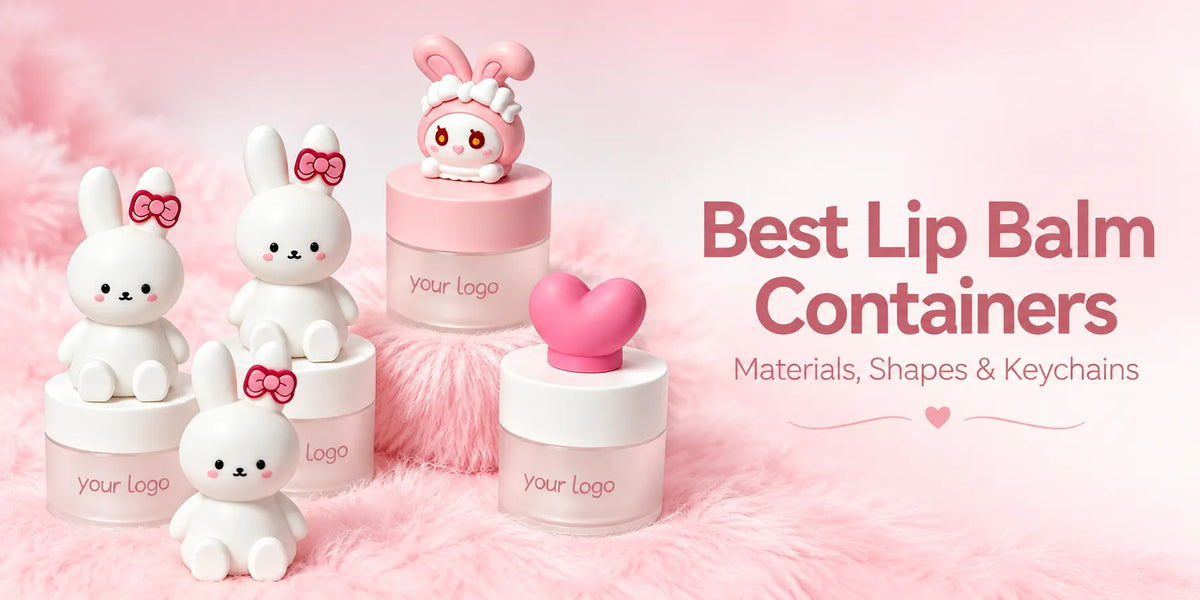
It can be especially useful in projects that are more playful, more giftable, or more visually expressive, including some directions adjacent to cute makeup packaging and innovative cosmetic packaging. But the shell still has to stay category-correct. A tactile route that works on a novelty-led gloss cap may feel completely wrong on a cleaner premium component that depends on restraint.
3. 3D Printing, Silk Screen Printing, and Heat Transfer Printing Solve Different Problems
Clients often compare 3D printing with silk screen printing and heat transfer printing because all three are used to strengthen graphic presence on a shell. But they solve different decorative problems and create very different commercial results.
- Silk screen printing: usually becomes stronger when the package needs cleaner branding, simpler graphic information, and more controlled logo placement. It is often the practical choice when the design is relatively straightforward. But once the artwork becomes much more colorful or layered, silk screen printing usually starts requiring more color-by-color setup and more disciplined registration control.

- Heat transfer printing: usually becomes stronger when the shell needs fuller multi-color artwork across the surface, but the project still prefers a flatter image-led route. It remains useful when broad visual storytelling matters more than dimensional refinement.

- 3D printing: usually becomes stronger when the shell needs multi-color decorative richness, clearer layered imagery, and more dimensional visual presence. Compared with silk screen printing, it can reduce the need to break the design into simpler color-by-color logo logic. Compared with heat transfer printing, it often creates a more refined, more premium-looking result when the project needs stronger graphic clarity and more advanced decorative expression.

So the decision is not which route sounds more advanced. The decision is whether the shell needs simple branding, full-coverage flat artwork, or more refined dimensional surface expression. 3D printing often costs more than simpler print routes, but it can also deliver a more polished and more premium-looking visual result when the project genuinely needs that level of finish.
4. 3D Printing Is Usually Strongest in Innovation-Led and Novelty-Led Color Cosmetics
At KAIYA, 3D printing is most convincing when the project is already innovation-led, tactile-led, or more collectible by design. It can support packaging that needs to feel more interactive, more giftable, or more physically distinctive. That may include certain lip components, more expressive compact surfaces, themed decorative zones, or packaging that needs a stronger novelty story than a flat print process could deliver.
This is also why 3D printing can sit naturally inside broader discussions around keychain makeup packaging and other trend-led formats where physical charm and touch-led appeal matter more than minimalism. The route is not there only to impress visually. It is there to make the shell itself feel more memorable.

5. Category Discipline Still Matters More Than Decorative Excitement
The fact that 3D printing can create a more developed effect does not mean every category should use it. In some components, dimensional decoration can interfere with how premium the package feels. In others, it can actually strengthen product identity because the category already allows more visual playfulness or stronger tactile novelty.
This is why KAIYA usually checks whether the raised effect improves the category or only adds surface drama. A route that helps the shell feel more collectible or more engaging in hand may be useful. A route that simply adds complexity without improving category clarity is usually not worth carrying into deeper development.
6. Sample Review Should Focus on Relief Quality, Edge Cleanliness, and Touch Logic
In 3D printing projects, sample review should go beyond “does this look special?” The better questions are whether the raised layer stays clean at the edges, whether the tactile effect feels deliberate instead of clumsy, whether the relief is scaled correctly for the component, and whether the shell still looks commercially believable once the novelty wears off.
This matters because dimensional decoration can exaggerate mistakes very quickly. If the relief is too aggressive, the package may feel cheap instead of distinctive. If it is too weak, the route may not justify itself at all. KAIYA therefore evaluates 3D printing through actual shell handling, not just visual approval on a still image.
It also has to be compared inside the broader complete surface treatment solutions system. The package should still feel coherent with the rest of the line, not like a one-off decorative experiment.

7. KAIYA Uses 3D Printing When Physical Identity Matters More Than Flat Graphics
KAIYA treats 3D printing as a selective route for makeup packaging that needs raised, tactile, or more physically expressive decoration. It is strongest when that dimensional effect genuinely improves the product story and helps the shell feel more memorable in the hand.
If a package only needs cleaner branding or fuller image coverage, flatter print routes may still be more commercially sensible. But if the shell needs actual relief, stronger touch-led novelty, or more dimensional decorative identity, 3D printing can become the stronger answer. If you are comparing it against heat transfer printing, silk screen printing, or another finish path, KAIYA can help evaluate the route on the real component before the project moves too far into final process decisions.