Heat transfer printing becomes useful in makeup packaging when the brand needs more than a logo, a name line, or one metallic accent. Its real value is broader visual coverage. If the shell needs multi-color graphics, fuller illustration, or a more continuous decorative skin, heat transfer printing often becomes more relevant than simpler print routes.
At KAIYA, this process is not treated as a decorative upgrade by default. It is reviewed as a selective graphic-coverage route. The question is not whether the package can carry more artwork. The question is whether more artwork actually helps the product sell more clearly, look more complete, and still stay commercially disciplined in production.

That is especially important in color cosmetics because many components are small, curved, and already visually dense. A process that works beautifully on a flatter or more visible shell can become excessive on a narrow cap or a small tube. This is why KAIYA treats heat transfer printing as a packaging decision, not just an artwork decision.
- Quick screening framework:
- 1. decide whether the shell really needs fuller multi-color artwork or only selective branding;
- 2. confirm that the component has enough visible surface to justify broader image coverage;
- 3. compare heat transfer printing mainly against 3d printing before locking the route;
- 4. check whether the category can carry denser graphics without losing clarity;
- 5. judge the process on the real component, not only on the flat artwork file.
1. Heat Transfer Printing Is Mainly a Multi-Color Graphic Coverage Process
In practical makeup packaging development, heat transfer printing is most valuable when the shell needs broader visual storytelling. That may mean fuller pattern coverage, stronger illustration, more complete theme expression, or a denser multi-color graphic than silk screen printing would normally carry cleanly. In other words, it is not mainly a “premium” process. It is a process for when the package needs more image.

This is why heat transfer printing often appears in projects that are more playful, more theme-led, or more graphic-heavy. It can be especially relevant when the product is trying to communicate mood, collectibility, gifting value, or a seasonal story through the outer shell itself. If the shell only needs a clear logo and restrained communication, a simpler route is usually more honest.
2. The Best Candidates Usually Have Enough Surface to Carry Real Artwork
Heat transfer printing works best when the shell gives the artwork enough room to matter. Selected cosmetic tube packaging routes, squeeze formats, and larger visible shells are common candidates because the graphic can actually be seen and understood in use. This is one reason it can work well on more visual lip formats, selected face packaging, and certain novelty-led components.
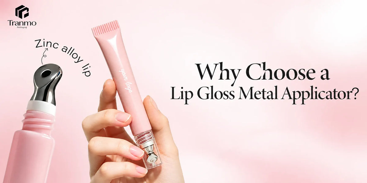
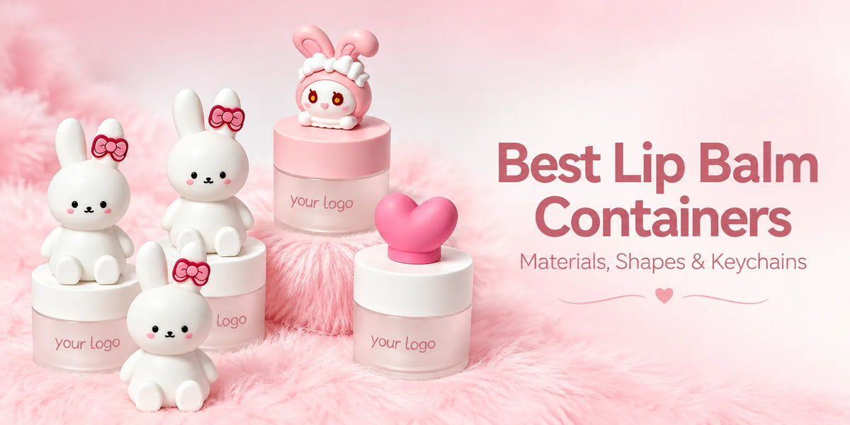
For example, some lip gloss squeeze tube containers can benefit from more complete graphic coverage if the product story is strongly trend-led or image-led. A broader graphic layer may also make sense on selected cute, giftable, or limited-edition packaging where the shell itself is meant to carry more personality. But on very small or already detail-heavy components, the same process can make the package feel crowded rather than stronger.
3. Compare Heat Transfer Printing with 3D Printing Before You Commit
- Heat transfer printing: stronger when the package needs fuller multi-color graphics, broader illustration, or more continuous decorative coverage across the shell.
- 3D printing: stronger when the package needs a more tactile, raised, or dimensional decorative effect that physically changes how the artwork is experienced on the surface.

This comparison matters because heat transfer printing and 3d printing are often discussed side by side even though they do not solve the same visual problem. Heat transfer printing is usually the more commercially efficient route when the main goal is multi-color artwork coverage across the shell. 3D printing usually becomes stronger when the brand wants texture, relief, or a more obviously dimensional decorative effect. The 3D result can feel more premium and more tactile, but not every product needs that added surface drama.
So the better question is not which process sounds more advanced. The better question is what the shell actually needs to communicate. If it needs more image, pattern, and color coverage, heat transfer printing may be the better route. If it needs more tactile emphasis, dimensional surface effect, or a stronger touch-led novelty signal, 3D printing may deserve closer attention.
4. Heat Transfer Printing Is Often Better for Theme-Led, Cute, or Graphic-Heavy Projects
KAIYA most often sees heat transfer printing become convincing in projects that depend on visual storytelling rather than only structural authority. That may include selected tube-led products, certain face formats with enough decorative area, and packaging directions that are intentionally more playful, seasonal, or giftable. It can also sit naturally near cute makeup packaging where denser artwork helps the component feel more complete and more commercially expressive.
The process can also make sense when the shell itself is relatively standard but the brand still wants the finished package to feel more visually developed. In those situations, heat transfer printing can increase the perceived completeness of the package without forcing a completely different structure.

5. Do Not Use Heat Transfer Printing Just Because It Can Carry More Decoration
More decoration is not automatically better decoration. Some makeup categories benefit from graphic richness, while others depend more on restraint, material expression, or cleaner hierarchy. If the package already has enough structure, enough proportion, or enough visual authority, too much transferred artwork can make the product feel less premium rather than more distinctive.
This is why KAIYA does not recommend heat transfer printing just because the artwork file looks attractive on screen. The process has to stay category-correct. A dense visual route that works for a playful squeeze format may feel completely wrong on a cleaner premium shell. The shell still needs to read first as makeup packaging, not just as a decorated object.
6. Sampling Should Focus on Edge Quality, Readability, and Graphic Weight on the Real Shell
In heat transfer printing projects, the sample review should go beyond asking whether the artwork looks attractive. KAIYA usually checks whether the transferred image stays clean at the edges, whether text and graphics remain readable once wrapped onto the real component, and whether the total visual weight still fits the category.
This is where many projects become clearer very quickly. Artwork that feels balanced on a flat file can feel too heavy once it wraps around a curved tube or a smaller shell. The process also has to be judged inside the broader complete surface treatment solutions plan so the decorative layer still feels coherent with the rest of the collection.
The best sample is not the one with the most artwork. It is the one where the expanded artwork still looks controlled enough to belong to the category and credible enough to survive scale-up.

7. KAIYA Uses Heat Transfer Printing When Fuller Graphics Improve the Product, Not Just the Surface
KAIYA treats heat transfer printing as a selective route for packaging that needs fuller artwork without moving straight into more complex structural change. It becomes useful when broader graphics improve the product message, help the shell feel more complete, and still remain commercially believable in mass production.
If a package only needs a clean logo, a simpler print route may be better. If it only needs metallic emphasis, hot stamping may be stronger. If the product calls for raised or more tactile decorative presence, 3D printing may deserve the focus. But when the shell genuinely needs fuller multi-color visual coverage and can carry that density responsibly, heat transfer printing often becomes the more practical and commercially balanced answer.
If you want to compare heat transfer printing against silk screen printing, hot stamping, or 3D printing for a real packaging component, KAIYA can help review the route on the actual shell before the project moves too far into final sampling.