Gold cosmetic packaging is rarely neutral. The moment gold appears on a shell, it starts telling the customer something about value, hierarchy, and product role. In color cosmetics, that can be useful because gold quickly creates warmth and premium emphasis. But it can also become one of the easiest ways to make a line feel too formal, too crowded, or too similar across every SKU.
At KAIYA, gold is not treated as “luxury by default.” It is treated as a signal. The real question is not whether gold looks attractive. The real question is what kind of importance the gold is supposed to communicate, which products should carry that message, and how much metallic weight the collection can absorb before the line starts losing clarity.

- Quick screening framework:
- 1. decide whether gold should act as a hero signal or only as a support accent;
- 2. choose whether the line needs full-shell gold or selective gold detail;
- 3. decide which product families can carry stronger metallic warmth without losing category logic;
- 4. compare the gold route against black, white, pink, or clear support colors;
- 5. confirm that the first gold sample still feels useful when imagined across the wider assortment.
1. Gold Usually Works Best When It Signals Importance
Gold tends to work best when the brand needs the customer to recognize one product as more elevated than another. That may mean a hero lipstick, a more premium gloss cap, a stronger compact shell, or a selected eye product that needs more shelf presence. Gold is effective because customers already read it as a warmer premium language. The problem starts when every product tries to speak with the same metallic intensity.
For that reason, KAIYA usually reviews gold through product role first. Which SKU is the hero? Which SKU only needs support? Which SKU should stay quieter so another item can lead? Once that hierarchy is clear, the gold route becomes easier to control. Without hierarchy, gold usually turns from useful emphasis into visual noise.
2. Full Gold and Accent Gold Are Not the Same Strategy
One of the most important decisions in gold cosmetic packaging is whether the project really needs a full gold shell or whether selective metallic emphasis is enough.
- Full gold: usually makes the biggest statement. It can work for hero lip packaging, selected compacts, or special editions where the shell itself is supposed to carry strong metallic authority.

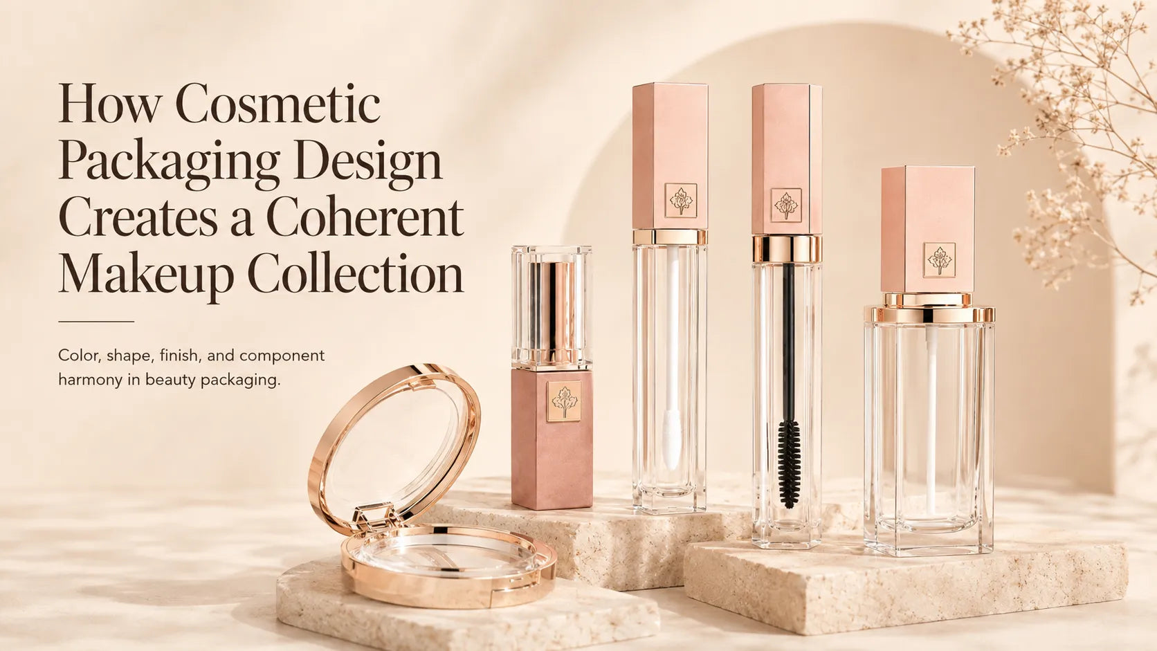
- Accent gold: often works better when the collection still needs warmth and premium cues but cannot afford full metallic intensity on every SKU. A gold ring, cap detail, logo zone, collar, or shoulder can often communicate enough without turning the whole product into a metallic object.

This is why many strong lines rely on selective hot stamping rather than assuming every component should be fully gold. In practical collection building, accent gold usually scales more easily than full-shell gold because it preserves hierarchy instead of flattening it.
3. Gold Does Not Land Equally Well on Every Product Family
- Gold lipstick packaging: this is one of the most natural places for gold because lipstick already allows a stronger hero-SKU attitude. Gold can make the shell feel more ceremonial, more giftable, and more deliberate very quickly, provided the closure and proportion stay convincing.

- Gold lip gloss containers: gold often works better more selectively here. A gold cap, collar, or framing element can create enough premium warmth while still letting gloss stay readable and display-led. Fully gold gloss shells are sometimes useful, but they usually need stronger control so the product does not lose clarity.

- Gold mascara bottle and gold eyeliner packaging: these routes can look polished fast, but eye products absorb metallic formality more aggressively than many teams expect. A little gold often goes a long way. On small eye components, the line can tip into “too formal” sooner than on lip formats.

- Gold powder compact or cushion-adjacent compact: gold can be very effective here because the compact has enough physical presence to justify stronger finish weight. But because the shell is larger, the metallic decision has to be judged across the whole face line, not only as a single approved sample.

- Gold stick packaging: this route tends to be strongest when the stick is meant to feel more hero-led or more giftable. If the stick is supposed to feel more functional, too much gold can become distracting.

4. Gold Is Also a Process Decision, Not Just a Color Decision
Gold changes meaning depending on how it is made. A highly reflective route created through vacuum metallization will not behave like a more selective metallic hit created through hot stamping. A warmer or softer metallic route can also be approached through a more controlled spray coating direction.
This matters because the wrong gold process can change the whole tone of the packaging. A more reflective gold may feel stronger and more visible, but also colder and more showy. A more selective foil route may feel cleaner and more precise. A softer surface route may feel warmer and easier to integrate into a broader line. KAIYA usually treats these as different packaging messages, not minor finish variations.

5. Gold Often Becomes More Useful When Another Color Keeps It in Check
Many strong gold lines rely on contrast. Gold on its own can become too warm or too uniformly “special.” But once another color enters the system, gold often becomes more readable and more commercially disciplined.
- Gold + black: usually feels richer, more premium, and more controlled. Black gives gold stronger edges and keeps the line from drifting too soft.

- Gold + white: usually feels cleaner and lighter. White can make gold feel more modern and less visually dense.

- Gold + pink: usually feels warmer, softer, and more decorative. This is often useful when the brand wants premium warmth without a hard luxury tone.

- Gold + clear: can work especially well on gloss or bottle-led concepts where the formula still needs to stay visible and the gold acts more as framing than as the full story.

- Gold + cooler accents: can help prevent gold from feeling too traditional when the collection wants a more modern edge.
This is why KAIYA usually reviews gold against neighboring directions such as black cosmetic packaging, white cosmetic packaging, pink cosmetic packaging, and the broader gold cosmetic packaging route before the final packaging logic is locked.
6. KAIYA Uses Gold to Clarify Hierarchy, Warmth, and Product Role
KAIYA supports gold cosmetic packaging by comparing hero versus support roles, full-shell versus accent logic, process routes, and companion-color strategy. The objective is not simply to make the line look more expensive. The objective is to make gold tell the customer something useful: which product matters most, where premium weight should sit, and how the collection should be read at shelf level.
For brands evaluating gold now, the strongest first step is to define what gold is supposed to improve. Should it give the hero lipstick more authority? Should it make the gloss cap feel more premium? Should it warm up a compact that otherwise feels too cold? Once that is clear, KAIYA can help compare the right gold route with much more confidence and much less waste.