Pink cosmetic packaging is one of the most commercially useful color directions in color cosmetics, but it is also one of the easiest to misuse. At KAIYA, pink is treated as a system decision, not just a decorative choice. A strong pink route should clarify category roles across lip, eye, and face formats while still supporting one recognizable brand mood.
In practical development, pink can appear in very different component families: foundation pink packaging, pink mascara bottle routes, pink lip gloss packaging, pink lip balm containers, pink lipstick packaging, and even pink nail polish bottle concepts. The key is not to apply one shade everywhere, but to define where pink should lead and where it should support.

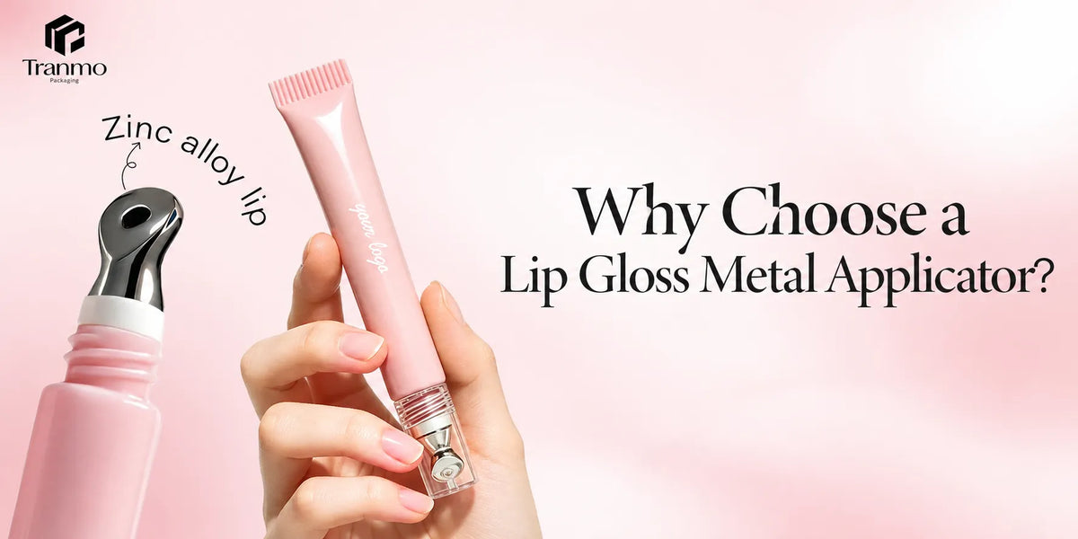
A clear pink PETG gloss tube does not communicate the same thing as an opaque pink lipstick shell. A frosted pink foundation bottle does not behave the same way as a hot pink mascara bottle. Even when the color family looks related on a mood board, the commercial reading changes once transparency, surface finish, and component size change. That is why KAIYA usually evaluates pink through real component families first and color preference second.
At KAIYA, this planning usually starts by deciding which categories should carry the strongest pink signal first, then checking whether that pink route still works across lip, eye, and face components without flattening the line. In practice, the same pink that works on lip gloss containers may need a more controlled finish on a mascara tube or a softer presentation in a complexion-led bottle.

- Quick screening framework:
- 1. decide whether pink should lead the line or support it;
- 2. choose which categories can carry stronger pink safely;
- 3. separate soft pink, bright pink, and metallic pink instead of treating them as one route;
- 4. check whether finish consistency can hold through repeat orders;
- 5. expand shades only after one stable pink path has been proven.
1. Define the Pink Hierarchy Before Selecting Components
Pink makeup packaging should start with hierarchy. Which SKU is the visual anchor? Which SKU is the volume driver? Which SKU should stay restrained? Without this hierarchy, pink can quickly make a line feel repetitive instead of intentional.

For example, a brand may let pink lip gloss tubes and pink lip gloss containers carry stronger playfulness, while keeping a pink mascara bottle or pink liquid eyeliner container more restrained through tighter finish control. A lipstick line may use a warmer opaque pink shell with a sharper metallic detail, while the gloss line keeps more transparency so shade visibility still does part of the selling work. This keeps the line readable while preserving category differences.
At KAIYA, this hierarchy is usually documented before structural sampling begins. Teams that define this early can make faster decisions on shade depth, finish intensity, and cap-detail level, while teams that skip it often rework packaging direction later when cross-category coherence issues appear.
2. Lip Category: Where Pink Usually Performs Best
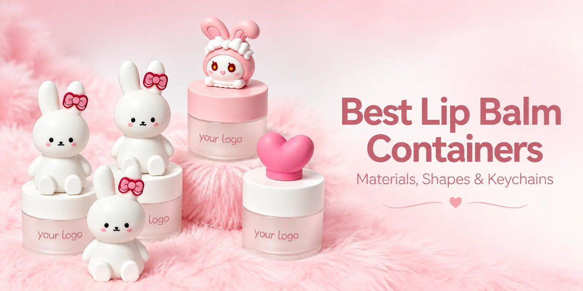
Lip categories usually absorb pink most naturally because the category already tolerates more emotional color language. Pink lip gloss packaging, pink lip gloss tubes, and pink lip balm containers can support giftability, softness, and social-ready shelf appeal without forcing the product out of category. In lipstick lines, pink lipstick tube and pink lipstick packaging routes can work well when shell precision and cap authority are preserved.

At KAIYA, lip-line pink planning is often evaluated together with lip balm containers and lipstick tubes so visual softness does not weaken premium cues.
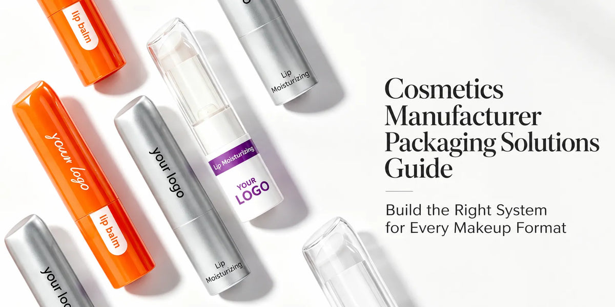
In operational terms, this means balancing playfulness and structure authority in the same line. A clear pink gloss tube may benefit from visible formula and a brighter cap because the product is display-led. A pink lip balm container usually benefits from a softer and more everyday tone because it is handled repeatedly and often positioned as practical lip care. A pink lipstick tube usually needs the strongest shell discipline of the three because once the shell loses precision, the line stops looking premium very quickly.

The better outcome usually comes from controlled contrast across gloss, balm, and lipstick roles. One realistic route is to let gloss take the most playful pink, let balm stay softer and cleaner, and let lipstick use a more controlled pink with stronger cap definition or metallic detailing.
3. Eye Category: Use Pink with Tighter Control
Eye formats need tighter pink control than many teams expect. A pink mascara bottle or hot pink mascara bottle can attract attention quickly, but it also exposes finish inconsistency faster in repeat orders. The same applies to a pink empty eyeliner bottle or another pink liquid eyeliner container route, where a small shift in gloss, tone, or metallic balance can suddenly look much larger because the component itself is small and the eye category is precision-led.

KAIYA generally recommends validating eye-category pink through pilot-lot finish checks before broad SKU rollout, especially when metallic or high-gloss routes are involved.

For repeat orders, this category also benefits from fixed visual references. Eye packaging tends to expose minor drift quickly, so teams should keep one approval baseline across first lot and reorders instead of resetting acceptance criteria by batch. In practice, lighter pink usually reads softer and cleaner on mascara than very saturated pink, while stronger hot pink usually needs tighter control to avoid moving into novelty faster than the brand intended.
4. Face Category: Pink as Accent, Not Always as Full Dominant
In face routes, foundation pink packaging and foundation pink bottle options can work when the brand wants a softer complexion story, but pink intensity should match positioning. Over-saturating face categories with one pink tone can reduce product distinction between foundation, blush, and support formats.

This is where a controlled pink palette performs better than one-tone deployment. KAIYA usually separates anchor pink, support pink, and neutral buffer tones such as white cosmetic packaging to keep face-line readability stable. A frosted pink foundation bottle can feel softer and more complexion-led than a fully opaque bright pink shell. A clearer or semi-transparent bottle may also help the formula and shade family stay legible, which can matter more than making the whole face line look uniformly pink.

That separation is especially useful when foundation and blush are sold together in one collection. If both use identical pink weight, customers may read them as one tonal block rather than as distinct face functions. Controlled variation keeps category navigation clearer at shelf level and usually produces a stronger retail result than trying to make every face SKU carry the same pink personality.
5. Pink Never Exists Alone Once Material and Finish Enter the Decision
One reason pink packaging often disappoints in production is that teams discuss pink as if it were only a color. In reality, pink changes meaning once material and finish change. A glossy metallized pink can feel toy-like or trend-led depending on the shell. A matte spray-coated pink can feel softer and more premium if the component shape is already strong. A clearer pink bottle or tube can feel fresher because the formula still remains visually involved in the package story.
This is why KAIYA usually reviews pink with the actual process stack. A pink gloss shell, a frosted pink bottle, a solid opaque pink compact, and a metallic pink cap are not minor variations of one idea. They are different packaging messages. The stronger result usually comes from deciding what the product should feel like first, then choosing the pink route that supports that outcome.
- Vacuum-metallized pink: this route usually works when the brand wants pink to feel more reflective, more trend-led, or more visibly statement-making. It can be very effective on selected lip or eye components, but it needs discipline because too much reflective pink can quickly move the package toward toy-like novelty instead of controlled premium identity.

- Spray-coated pink: this route usually works when the brand wants pink to feel softer, calmer, and more mature in hand. When the shell shape is already strong, a matte or more controlled spray-coated pink can make the package look more premium and more deliberate than a brighter reflective route.

- Clear or semi-transparent pink: this route is often useful when the brand still wants the formula, shade family, or fill level to stay visually involved in the package story. It can work especially well on gloss, bottle, or selected tube-led projects where clarity helps the product feel fresher and more display-led rather than fully shell-dominated.

6. Color Pairing Often Makes Pink Work Better Than Pink Alone
Many successful pink programs do not rely on pink by itself. Pink often becomes more convincing when it is balanced with another color logic. Pink plus white can make the line feel cleaner and lighter. Pink plus gold can create a warmer premium signal. Pink plus clear packaging can make the line feel fresher and more display-led. Pink plus black can sharpen contrast if the line needs more attitude and visual edge.

Another useful route is layered pink itself. A deeper pink paired with a lighter pink can create clearer hierarchy across hero and support SKUs without abandoning the pink family. In practical terms, a brand may use stronger pink on the visual anchor product, then shift to a softer blush pink or lighter shell tone on support items so the collection still feels unified but not flat.

That is why KAIYA usually checks pink against neighboring routes such as gold cosmetic packaging, black cosmetic packaging, and white cosmetic packaging before the final direction is locked. In many projects, the question is not whether pink is the right color. The question is which supporting color helps pink stay commercially useful.
7. Common Mistakes in Pink Cosmetic Packaging Programs
The first mistake is treating pink as an aesthetic shortcut without category logic. The second is expanding pink variants before process repeatability is proven. The third is applying one pink route equally across lip, eye, and face without adjusting mechanical and finish priorities.
In operational terms, these mistakes usually increase correction loops and make reorders less predictable. KAIYA mitigates this by locking hierarchy, validating finish route by category, and staging expansion in controlled waves.
Another recurring issue is expanding SKU count faster than process stability. Teams often add light pink, hot pink, and metallic pink variants before confirming repeat consistency. KAIYA usually recommends proving one stable pink route first, then extending the palette with documented acceptance limits.

8. How KAIYA Builds Scalable Pink Packaging Systems
KAIYA supports pink cosmetic packaging through a practical framework: hierarchy definition, category-specific route planning, finish/process validation, and reorder governance. The goal is to keep pink makeup packaging commercially attractive while still technically stable at scale.
For brands planning pink cosmetic packaging now, the strongest starting point is to define which categories should carry the strongest pink signal first. Once that is clear, line coherence and production control become much easier to protect over time.
From there, KAIYA typically runs a phased model: role mapping, route validation, pilot consistency checks, and reorder governance lock. This sequence helps brands keep pink cosmetic packaging commercially attractive without sacrificing execution discipline as the assortment scales.