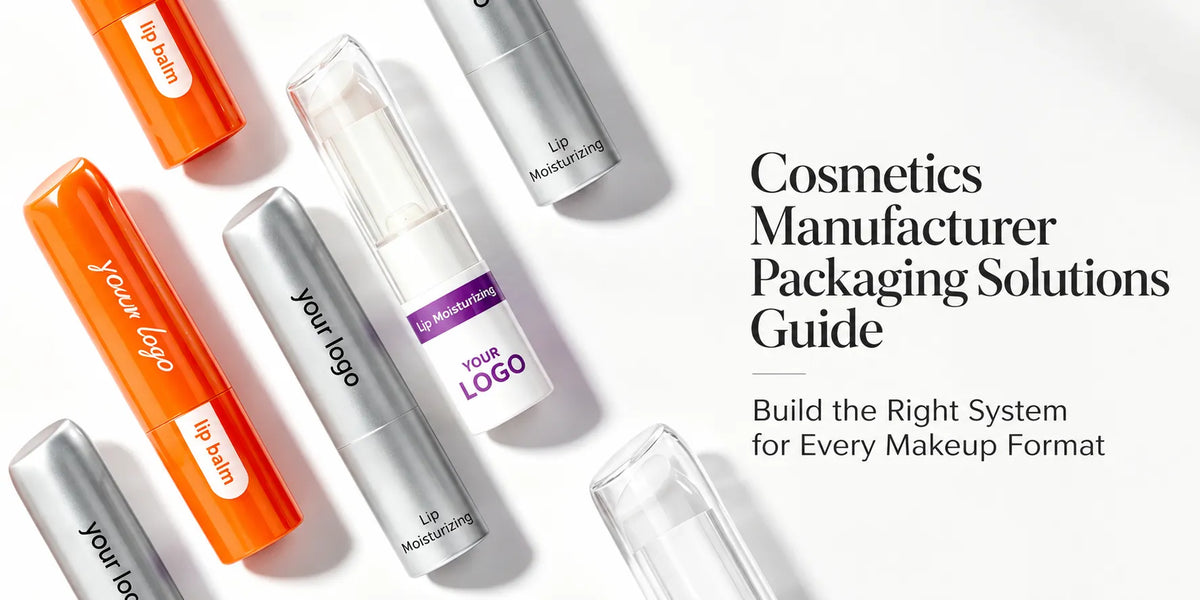
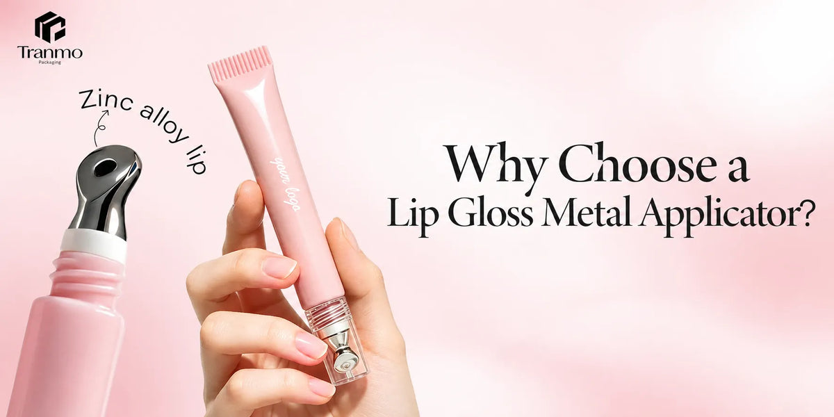
Silver makeup packaging can make a color-cosmetics line look cleaner, sharper, and more technical very quickly. At KAIYA, that is exactly why silver has to be planned with more discipline than many teams expect. If the finish is used well, it can create a modern premium signal and help selected lip, eye, and face components feel more precise. If it is used without hierarchy, the line can become too cold, too uniform, or too detached from the emotional role of the products.
This matters because silver does not behave the same way across all categories. A silver route can feel highly convincing on lip gloss caps, mascara packaging, compact lids, and selected stick components, but it may need more restraint on products that already depend on softness, warmth, or gift-led appeal. That is why KAIYA usually treats silver as a category-planning color, not simply as a metallic finish choice.

- Quick screening framework:
- 1. decide whether silver should lead the line or only support hero SKUs;
- 2. compare silver against white, black, gold, and clear before scaling;
- 3. separate full silver shells from accent-only silver details;
- 4. check whether the shell underneath is strong enough to carry a colder metallic language;
- 5. make sure the silver route still supports category clarity after support SKUs are added.
1. Why KAIYA Treats Silver as a Precision Tool Rather Than a Generic Metallic Finish
At KAIYA, silver is strongest when it helps the line feel more precise. That precision may look more modern, more technical, more polished, or more controlled depending on the shell and the surrounding color system. But the point is not to make everything more reflective. The point is to make the right categories feel cleaner and more intentional.
This is why KAIYA usually checks whether silver is being used to clarify hierarchy or only to add metallic brightness. In many projects, silver becomes more useful when it highlights selected heroes or reinforces a colder premium direction across eye, lip, and compact categories. If every package receives the same silver treatment, the line can lose internal order very quickly.

2. Where Silver Makeup Packaging Usually Works Best in Color Cosmetics
KAIYA usually sees silver working most naturally in categories that already tolerate a cleaner or more technical premium language. That can include lip gloss components, mascara packaging, compact lids, selected eyeliner or brow formats, and some stick-led products where the shell should feel more controlled than decorative. Silver is often especially useful where the package needs a cooler premium cue rather than a warmer one.
- Lip gloss and lip-led details: silver often works well on caps, collars, or accent zones when the line needs cleaner premium rhythm without moving fully into heavier gold language.
- Mascara and eye packaging: silver can feel especially natural in precision-led categories because it supports a more technical, sharper, and more modern reading.
- Compact and stick components: silver can strengthen shelf cleanliness and product authority when the shell itself is already disciplined enough to support a colder metallic direction.

This is also where KAIYA checks whether the reflective route should stay full-silver or become more selective. A full metallic shell may help a hero SKU. A more limited silver accent may work better when the line needs colder premium cues without losing softness or balance.
3. How Silver Compares with Gold, White, Black, and Clear
KAIYA rarely reviews silver in isolation. The stronger question is what silver does better than the neighboring routes in the same collection.
- Silver vs gold: silver usually feels cooler, cleaner, and more technical, while gold feels warmer, more formal, and more overtly premium.
- Silver vs white: silver usually adds more metallic structure and sharper contrast, while white tends to feel cleaner, lighter, and softer.
- Silver vs black: silver usually creates a more reflective and modern premium cue, while black stabilizes the line and gives stronger visual weight.
- Silver vs clear: silver adds finish authority and colder hierarchy, while clear packaging depends more on formula visibility and cleaner transparency logic.

This comparison helps KAIYA judge whether silver should be a lead direction or a supporting accent. In some lines, silver is most useful when it sits beside white cosmetic packaging to create a cooler clean-tech system. In others, it works better as the colder counterpoint to gold cosmetic packaging or as a brighter precision layer beside black cosmetic packaging.
4. Why Silver Still Needs Structure and Finish Discipline
Silver can make weak structure more visible just as quickly as it can make strong structure feel premium. If the shell family lacks enough proportion control, clean surface discipline, or category authority, the metallic route may start to feel cold and empty instead of controlled and premium. That is why KAIYA usually checks the shell first and the silver treatment second.
This also affects finishing choices. A silver route may be expressed through vacuum metallization, controlled hot stamping, or other metallic-accent strategies depending on whether the line needs full reflective impact or only sharper metallic hierarchy. The better route is the one that matches the product role rather than simply maximizing shine.

5. How KAIYA Connects Silver Makeup Packaging with Real Product Families
KAIYA usually reviews silver through actual packaging routes rather than through abstract metallic mood. That means checking the dedicated silver makeup packaging page, the wider color cosmetic packaging by color system, and selected category anchors such as lip gloss containers, mascara tube, and cosmetic compact case.
This keeps the silver route grounded in actual color-cosmetics use. The finish should still make sense on the component family itself. The stronger route is the one where silver improves readability, hierarchy, or category authority rather than replacing those things.

6. How KAIYA Supports Silver Makeup Packaging Development
KAIYA supports brands that need practical and production-ready silver makeup packaging from a China-based supplier. We review silver through hierarchy, category fit, metallic temperature, and how the reflective or metallic route should move across real lip, eye, and selected face categories.

For teams evaluating silver makeup packaging, the best first step is to define what the silver direction is supposed to improve in the line. Once that is clear, KAIYA can help compare full-silver, silver-accent, and cooler metallic routes through category clarity, finish discipline, and long-term collection usefulness. If you want to explore a silver route for your line, KAIYA can help assess which categories should carry it most strongly and which should stay more restrained.