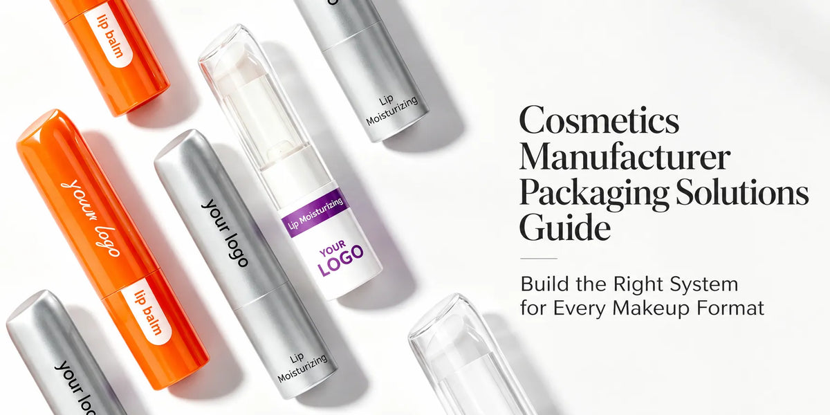
White cosmetic packaging can create a clean and recognizable makeup line, but white is not a single fixed design result. A bright white gloss tube, a warm matte compact, a pearl-white lipstick shell, and a clear bottle with a white cap all communicate differently. The final effect comes from the white tone, base material, surface finish, product shape, and accompanying colors.

This article explains how white tone, material, finish, color pairing, and product format change the final result, helping buyers turn a broad “white packaging” request into a clearer sourcing and sampling direction.
Quick screening framework:
- Define the target white tone and whether white leads the full package or selected components.
- Match the material and surface process to the required gloss, texture, and hand feel.
- Select supporting colors according to the product category and collection direction.
- Approve the complete color and finish on physical packaging before production.
1. White Is a Design Base, Not an Empty Choice
White gives other details room to become more visible. A black logo looks sharper, a metallic collar becomes a clear focal point, and a transparent body can show the formula without competing with a strong cap color. This makes white cosmetic packaging useful for clean, minimal, soft, professional, playful, or premium product lines—not only one visual style.

The useful question is what role white should play. It may lead the full package, provide a neutral background for the logo or formula, or connect several SKUs through repeated white caps, bodies, or frames. Defining that role first keeps the collection from becoming flat or inconsistent.
2. Start by Defining the White Tone
Two samples described as “white” may look noticeably different when placed side by side. Resin color, coating formula, substrate, gloss level, lighting, and surrounding colors can make the same reference appear cooler, warmer, brighter, or slightly grey.
- Bright neutral white: gives the package a crisp base and creates strong contrast with black text, vivid color blocks, or metallic details.

- Cool white: works well with silver, blue, grey, or black when the collection needs a sharper and more modern direction.

- Warm white or ivory direction: softens the package and pairs naturally with nude, soft pink, champagne, or warm gold accents.

- Pearl white: adds a fine reflective effect to the surface. Because pearl intensity changes with lighting and viewing angle, it should be approved from a physical sample rather than a digital color reference alone.

For a product family, buyers should confirm whether every component must match one white exactly or whether a controlled difference is intentional. A white cap on a clear lip gloss body does not create the same matching challenge as a lipstick tube, mascara tube, and compact case that all need to appear as one coordinated set.
3. The Material Route Changes How White Appears
Plastic: Plastic is the main route for many white cosmetic containers because it supports tubes, caps, jars, compacts, palettes, and stick structures with broad shape and cost options. White can be molded into suitable plastic cosmetic packaging or added through a surface coating. Molded white avoids a separate painted layer, while coating provides more control over gloss, touch, and the visible coverage of the substrate.

Glass: Selected glass cosmetic packaging can use a white, frosted, or coated appearance for foundation bottles and small jars. Glass adds weight and a different tactile direction, but it is not KAIYA's main route across every makeup category. Buyers should distinguish opaque white coating from translucent frosted glass because they provide different levels of formula visibility.

Aluminum: KAIYA can apply a white finish to selected aluminum outer shells for lipstick, mascara, or stick packaging. This route combines a clean white appearance with the material texture and feel of an aluminum component; the exact color, coating, and logo result should be confirmed on the finished sample.
4. Different Surface Processes Create Different White Effects
After the white tone and material are selected, the decoration process determines how the surface is presented. These processes solve different visual requirements and may also be combined after compatibility testing.
- Spray coating: creates controlled opaque white, matte, satin, glossy, pearl, or soft-touch surfaces depending on the confirmed coating system.
- Silk screen printing: adds solid-color logos, product names, or simple graphics over the white base without changing the full package color.

- Hot stamping: introduces localized gold, silver, rose-gold, or other foil details on logos, borders, and small decorative areas.

- UV coating: can add full or selective gloss over a white or printed surface, creating contrast between glossy details and a matte background.

A frosted or matte appearance is a final visual effect rather than one fixed process. KAIYA's frosted and matte finish page helps distinguish a translucent hazy surface from an opaque low-gloss white result.
5. Use Color Pairing to Give White a Clearer Role
White can lead the complete package or act as a neutral base for another color. A controlled two-color direction is often more distinctive than adding many unrelated accents.
- White and gold: Gold details add warmth and a more refined focal point. For white and gold cosmetic packaging, the gold can remain on a cap, collar, border, logo, or small structural detail so it does not overwhelm the white base.


- White and silver: Silver creates a cooler and more modern contrast, particularly on mascara caps, lipstick collars, compact frames, and logo details.
- White and black: Black provides the strongest graphic contrast for typography, component separation, or a clearly defined cap and body.


- White and pink: Pink accents soften the line and can support lip care, playful makeup, cute packaging, or softer collection themes.

- White and clear: Clear components allow the formula, pan, or internal structure to provide the color while white keeps the surrounding package restrained.

6. White Works Differently Across Lip, Eye, and Face Packaging
Lipstick and lip balm: White lipstick packaging may use a full white shell or pair a white body with gold, silver, black, or pastel details. White lip balm containers also work across standard tubes, mini formats, rounded caps, and selected shaped designs.

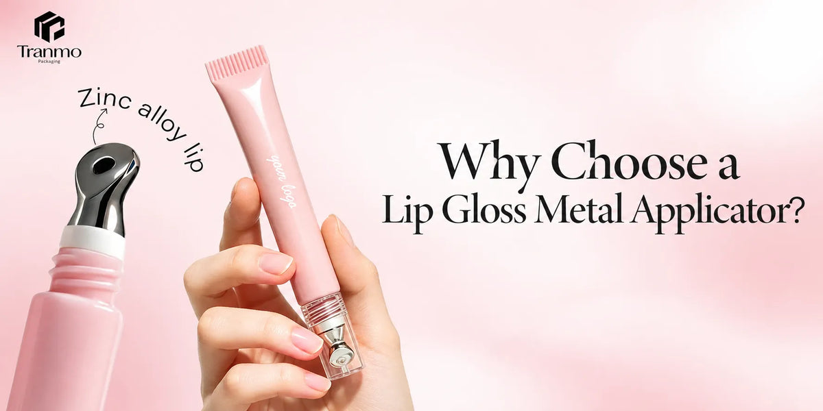
Lip gloss and lip oil: White lip gloss tubes may use an opaque body or combine a clear bottle with a white cap. The second route keeps the formula shade and shimmer visible while white provides a clean visual anchor.

Mascara and eyebrow products: A white mascara tube creates strong contrast with black or brown formulas and can be paired with black, silver, pink, or gold components. The bottle opening, wiper, and cap should control visible formula residue around the white surface.

Eyeshadow and face compacts: A white empty eyeshadow palette provides a broad base for logos, artwork, or metallic details. White powder, blush, and cushion cases can connect several face products through one restrained color system.

Stick packaging: White cosmetic stick packaging can be used for foundation, blush, contour, highlighter, sunscreen, and multi-use balm formats. A full white body creates a unified look, while a colored cap, base, or ring can identify different formulas or shades within the series.

7. Build a Coordinated White Packaging Line with KAIYA
KAIYA supplies white makeup packaging across lip, eye, and face categories and can coordinate the packaging structure with the selected white tone, material, finish, logo process, and supporting colors. Depending on the project, white can cover the full component, remain on a cap or frame, or work with transparent and metallic details.
Buyers can send the product category, required packaging structure, reference color or physical sample, preferred finish, logo artwork, target quantity, and the components that must match. KAIYA can then review suitable stock or custom options and coordinate the approved direction with other cosmetic packaging surface treatments before production.