Pad printing is one of the most practical decoration methods in makeup packaging when the shell needs clean branding on small, curved, or irregular surfaces that are not ideal for broader full-surface artwork routes. In color cosmetics, that makes it especially relevant on compact details, caps, tubes, sticks, and other components where the printable area is limited but brand precision still matters.
What makes pad printing useful is not visual drama. It is control. The process helps transfer small logos, fine marks, and selected graphic details onto shapes that would be awkward for flatter print methods. That is why KAIYA usually treats pad printing as a precision branding tool for difficult surfaces rather than as a broad decorative effect.

- Quick screening framework:
- 1. check whether the shell has a small, curved, or irregular print zone;
- 2. decide whether the project mainly needs a logo, small symbol, or simple controlled graphic;
- 3. compare pad printing with silk screen printing before choosing the route;
- 4. review registration expectations if more than one color is involved;
- 5. test print cleanliness on the actual shell geometry, not just on flat artwork files;
- 6. confirm that the printed area stays clear after handling and transport.
At KAIYA, pad printing projects are usually reviewed together with the pad printing page and the broader complete surface treatment solutions plan. The process becomes strongest when the component truly needs small-area print precision rather than broad decorative coverage.
1. Start by Asking Whether the Print Area Is Small, Curved, or Difficult
- Pad printing becomes useful when the surface itself is the main problem.
Many makeup packages do not offer broad, flat decoration zones. A cap shoulder, a small tube shoulder, a rounded stick shell, or a narrow compact detail may still need clean branding even though the printable area is awkward. This is the kind of situation where pad printing often makes more sense than broader graphic methods.
KAIYA therefore usually begins by checking the geometry of the print zone before reviewing artwork style. If the logo area is small and the shell shape is difficult, pad printing may already be the more logical starting point.

2. Pad Printing Is Often Strongest for Small Branding and Controlled Detail
- Use pad printing when the package needs accuracy on limited surfaces, not when it needs large-area visual storytelling.
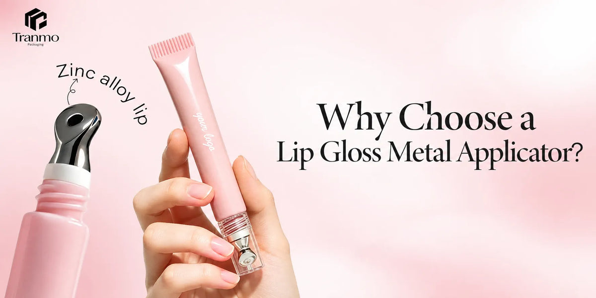
Pad printing is usually most useful for logos, symbols, small text, restrained decorative marks, and other graphic elements that need to sit cleanly on a small or curved area. It is often relevant on eyeliner packaging, eyebrow packaging, selected lip gloss containers, and compact or stick components where space is limited but brand presence still matters.
That is why KAIYA usually treats pad printing as a precision route rather than as a full-artwork route. If the shell needs more image-heavy graphics or broader color storytelling, another process may be more suitable.

3. Compare Pad Printing with Silk Screen Printing Before Choosing
- These two processes overlap in some projects, but they are not interchangeable.
- Pad printing: usually makes more sense when the print zone is small, curved, irregular, or visually awkward for flatter transfer methods. It is especially useful when the branding has to sit cleanly on a difficult shell rather than across a broad visible panel.
- Silk screen printing: usually makes more sense when the shell offers a more stable print zone and the project needs a cleaner, more established logo route across a broader visible area. It often feels more straightforward when the component geometry is less demanding.
-
How to decide: brands do not always need to begin from the machinery difference. The more useful starting question is whether the shell geometry favors a more adaptable small-area transfer method or a more stable broader print route. If the branding area is small and the shell is difficult, pad printing often deserves a closer look.

4. Curved Components Make Pad Printing More Relevant
- This is one reason the process appears often in smaller color-cosmetics components.
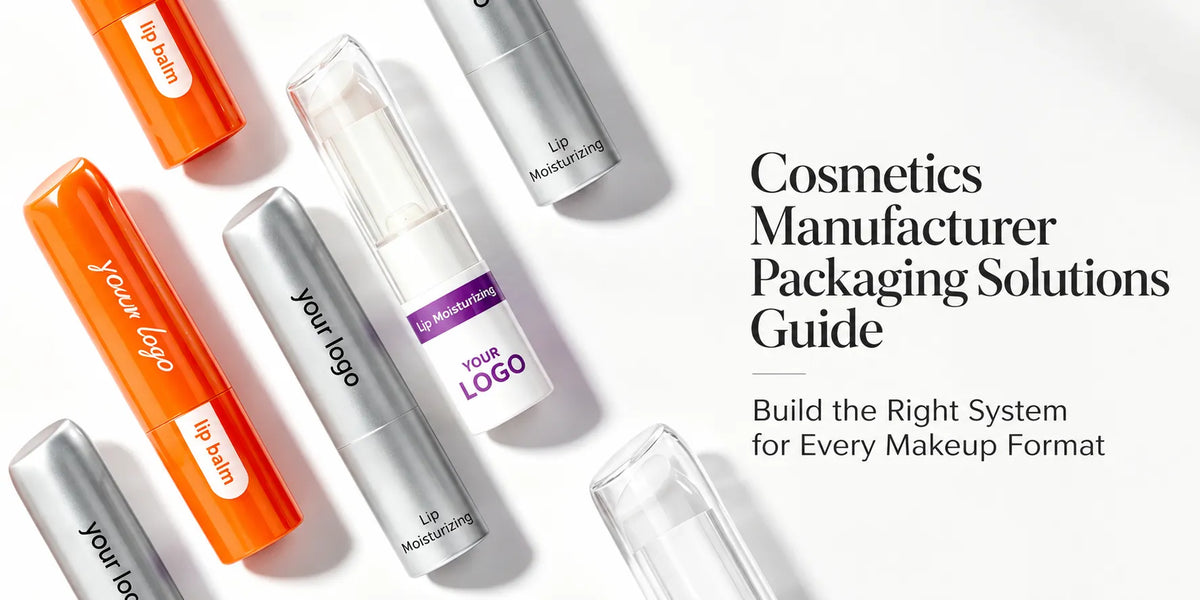
Many makeup formats combine rounded caps, small cylinders, tapered bodies, and tight logo zones. Those shapes are common in lip, eye, and stick packaging. On those components, the practical value of pad printing is that it can place controlled branding where the shell is visually important but structurally not easy to decorate.
That is why KAIYA often reviews pad printing on selected cosmetic stick packaging, smaller lip components, and other narrow-format shells. The process is not trying to make the package louder. It is trying to make branding cleaner where the shell is more difficult.

5. Pad Printing Is Also Highly Relevant to Cute Shaped Makeup Packaging
- This is one of the clearest reasons pad printing keeps appearing in playful novelty packaging.
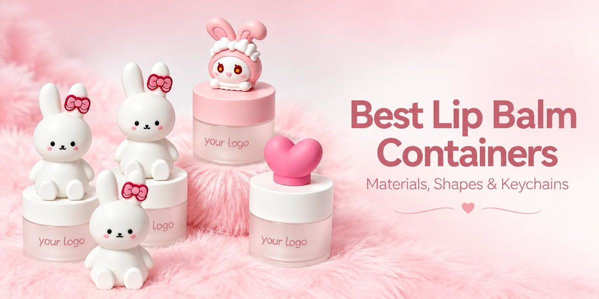
Pad printing is especially useful on cute shaped or character-led components because those packages often include rounded cheeks, raised curves, small facial areas, and irregular decorative zones that are not easy to decorate through flatter print methods. In practical terms, this means the process can help place eyes, mouth details, small facial expressions, and other controlled marks onto shaped surfaces more cleanly.
That is why pad printing is often a strong match for packaging built around rabbit shapes, pig shapes, and other cute novelty directions. On a rabbit-shaped component, for example, the process can help place small facial details in a way that makes the package feel much more vivid, animated, and commercially complete. In that kind of project, the process is not only about logo transfer. It is part of what makes the character concept feel alive on the real shell.

6. Multi-Color Expectations Need Realistic Registration Control
- Simple one-color branding is usually easier to defend than overly ambitious multi-color detail on a small curved shell.
Pad printing can support more than one color, but the more complex the artwork becomes, the more important registration control becomes as well. On a very small curved component, it is usually smarter to keep the branding disciplined than to force decorative complexity the shell cannot support cleanly.
KAIYA therefore usually checks whether the project really needs multi-color detail or whether a simpler print hierarchy would create a cleaner and more premium result. In many cases, more restraint produces a better package.
7. Sampling Should Focus on Edge Cleanliness and Surface Fit
- Do not approve pad printing only by checking the artwork file.
The real sample review should check line cleanliness, ink edge behavior, placement consistency, handling resistance, and whether the print still reads clearly on the actual shell shape. A print that looks good in flat proof form can still feel weak if it distorts, sits awkwardly, or loses visual balance on the real component.
KAIYA therefore treats pad printing samples as geometry checks as much as graphic checks. The question is not only whether the logo is correct. The question is whether it still belongs naturally on the shell after transfer.

8. Final Guidance
Pad printing is one of the most useful makeup-packaging processes when the shell needs small-area branding on curved or otherwise difficult surfaces. It is not the loudest decoration route, but it is often one of the most practical when the package needs clean brand communication on limited geometry.
KAIYA supports pad printing projects by helping brands compare shell geometry, print-zone size, registration expectations, and process fit before decoration is locked. If you are reviewing lip, eye, compact, or stick packaging and want to confirm whether pad printing is the most sensible route for your branding area, KAIYA can help evaluate it according to the actual component and actual production goal.