Logo placement on a cosmetic container is a structural decision as well as a graphic decision. A position that looks balanced on a flat artwork file may become distorted on a curved wall, disappear around an edge, rub against another component, or face away from the intended front after the package is closed.

Buyers should define the main viewing angle, usable decoration area, surface geometry, opening direction, and selected process together. KAIYA uses the assembled physical package to plan where the logo can remain readable and visually connected to the product shape.
Five questions to answer before placing the logo:
- Which side is the product's main front view?
- How much of the surface can be seen without rotating the package?
- Is the surface flat, cylindrical, tapered, convex, concave, or irregular?
- Which seams, joints, hinges, threads, and contact areas should be avoided?
- Which decoration process can reproduce the artwork on that exact surface?
1. Establish the Main Viewing Angle Before Sizing the Logo
The first step is to decide how the package will normally be presented. A lipstick tube may stand vertically with the cap facing upward. A lip gloss tube may be photographed from the broad front. A compact is often viewed from the top. A keychain or irregular package may hang at an angle rather than face forward on a shelf.

Place the assembled sample in its expected position and mark the visual center that can be read without rotating the product. This visible zone is more useful than the mathematically largest surface. A long logo placed too far around a cylinder may offer more total print width but lose readability from the main view.
For a cross-category project, KAIYA can compare the hero view across different cosmetic container types so the brand name remains recognizable even when the tube, stick, compact, jar, and bottle require different artwork proportions.
2. Cylindrical Containers Need a Controlled Reading Arc
Curved cosmetic containers such as round lipstick, mascara, lip gloss, and balm tubes offer continuous curvature rather than one flat front panel. A narrow vertical logo usually remains visible from one angle, while a long horizontal logo begins to wrap away from the viewer as it extends around the circumference.

The reading arc should therefore be approved on the real diameter. A design that fits a wide foundation bottle may need to become smaller, stacked, or vertical on a slim mascara tube. When artwork wraps around the body, decide whether it is intended as a continuous pattern or as a logo that must be read at once. These are different decoration goals.

Silk screen printing can create clean spot-color branding on suitable tube and bottle surfaces, but artwork scale, curvature, fixtures, and the available printing route still need to be confirmed through a decorated sample.
3. Tapered Surfaces Can Change the Logo's Proportion
A tapered container becomes wider or narrower along its height. If a straight logo is applied across too much of that change, the visual spacing may appear uneven even when the artwork file is correct. The buyer should select a zone where the taper is limited or intentionally adjust the artwork to the confirmed surface.
This applies to cone-like caps, sculpted lip products, egg-shaped bottles, and squeeze tubes that narrow toward the outlet. A shorter wordmark, centered emblem, or vertical layout can preserve recognition more reliably than stretching a long logo across the changing profile.

4. Convex, Concave, and Irregular Shapes Need Smaller, More Deliberate Areas
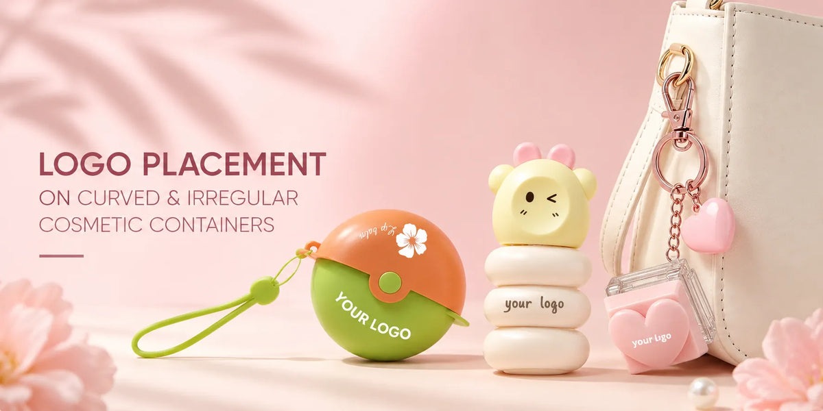
Animal, heart, flower, wave, gem-like, and other innovative cosmetic packaging may not provide a conventional front panel. The strongest position is often one controlled surface within the shape: a flatter body section, a cap top, an inserted badge, or a defined color panel.
Pad printing uses a flexible transfer pad and can suit small logos on selected curved, convex, concave, or irregular components. The printable area still depends on the depth of the curve, fixture access, artwork detail, material, ink, and position. A process that reaches the surface must also reproduce the logo at the required quality.

If the product shape is already visually complex, a smaller logo often creates a clearer result. The package silhouette can carry the recognition while the logo confirms the brand without competing with every contour.
5. Keep the Logo Away from Seams, Gates, and Assembly Gaps
Mold parting lines, gate traces, cap gaps, decorative rings, and multi-piece joints can interrupt printing or make the logo appear off-center. Before confirming the artwork, rotate the sample and identify these fixed structural features.
- Parting lines: can create a slight height or texture change across the print path.
- Gates and ejector traces: may remain visually detectable and should not sit directly under fine artwork when another position is available.
- Cap and body gaps: can divide a logo or change the spacing after assembly.
- Decorative rings and inserted panels: need consistent alignment with the printed artwork.
- Transparent walls: may reveal internal components behind the logo and change its contrast.

For an original shape, KAIYA can consider logo space during custom cosmetic packaging development instead of trying to find a decoration area only after the mold is complete.
6. Avoid Areas That Move, Rub, or Support the Grip
A logo placed across a thread, hinge, clasp, rotating collar, cap-fit surface, or high-contact grip area may be difficult to reproduce or more exposed to friction. On a lipstick, the body and cap rotate and separate. On a compact, the lid opens around a hinge and may contact the base. On a keychain package, the attachment and neighboring accessories may rub against the exterior.
Map these movements on the assembled sample. Decoration can then be positioned where normal opening, closing, carrying, or application creates less direct contact. For finishes that already require careful protection, the logo position should also be reviewed with the final packing arrangement.
7. Match the Logo Style to the Decoration Process
- Silk screen printing: works well for clear spot-color graphics and readable logos on suitable surfaces.

- Pad printing: can place smaller graphics on selected curved or irregular components where a flexible pad can reach.
- Hot stamping: adds metallic or colored foil accents; broad curvature, sharp transitions, and very fine details need sample confirmation.
- Laser engraving: creates a permanent mark on compatible surfaces and is useful when the contrast and material response support the design.

- Heat transfer printing: can support more extensive artwork or multi-color visual coverage on suitable components.

- Molded relief: integrates a raised or recessed mark into the component itself and normally belongs to a new-mold development rather than a standard decoration change.
The best process is the one that fits the surface, artwork, material, quantity, and desired effect. Do not enlarge or simplify the logo after the design is complete without checking how the change affects brand recognition.
8. Build a Logo Hierarchy across the Complete Package
Not every component needs the same logo treatment. A compact may carry the main mark on its top plate and a smaller product name inside. A lip gloss may use the brand on the body and a decorative cap without text. A lipstick can place the primary logo on the cap and a secondary mark on the base.

This hierarchy keeps small containers from becoming crowded. It also allows the most stable decoration area to carry the essential brand name while secondary surfaces support color, texture, or pattern. KAIYA's surface-treatment options can be coordinated around this hierarchy rather than adding every process to the same component.
9. Approve the Logo on the Final Assembled Sample
Review the decorated sample in its final body color, surface finish, and assembled orientation. Confirm the front view, logo scale, contrast, reading distance, edge definition, and alignment with the cap, hinge, or shape. Photograph the sample from the approved viewing angle and retain the artwork position measurements for repeat production.
KAIYA can help brands compare logo areas, decoration processes, appearance samples, and original-development requirements across standard and irregular cosmetic containers. Share the vector logo, intended package, color and finish direction, preferred viewing angle, quantity, and reference effect so the decoration route can be assessed before bulk production.