Colorful cosmetic packaging is often treated as a styling topic, but in B2B execution it is a system-design topic. At KAIYA, color decisions are evaluated through three business outcomes: faster shelf recognition, clearer SKU hierarchy, and better repeat-order consistency. If a color route cannot support these outcomes, it may look attractive in concept review but still perform weakly in line expansion.
That is why we do not start from “which color is popular.” We start from “which color role belongs to which product role.” In color cosmetics, the same hue can create opposite commercial effects depending on category placement. A color that works as a hero lipstick signal may be too loud for support eyebrow SKUs. A tone that reads premium on a compact cap may read flat on a tube with different finish behavior. Color strategy therefore needs structure strategy, not only mood boards.
KAIYA usually frames this work through color cosmetic packaging by color, then aligns execution with makeup packaging by application and cosmetic packaging by container type. This keeps color expressive while preserving category readability.
1. The Core Color Framework KAIYA Uses Before Picking Any Single Tone
Before selecting pink, gold, black, or any other family, KAIYA typically runs a five-layer review:
1) Brand temperature: playful, clean, premium, clinical, or hybrid.
2) Category hierarchy: which SKUs are hero, bridge, and support.
3) Format behavior: tube, bottle, stick, compact, and palette absorb color differently.
4) Finish route: matte, gloss, metallic, frosted, and print route change perceived hue.
5) Scale realism: can this color stay consistent across repeat orders and multiple components.
This framework prevents a common failure: over-committing to one strong visual sample that cannot hold system consistency in production. In practical terms, color decisions should be connected to finish and process planning under complete surface treatment solutions and cosmetic packaging materials.

2. Pink Family: Fast Conversion in Lip-Led and Youth-Led Clusters
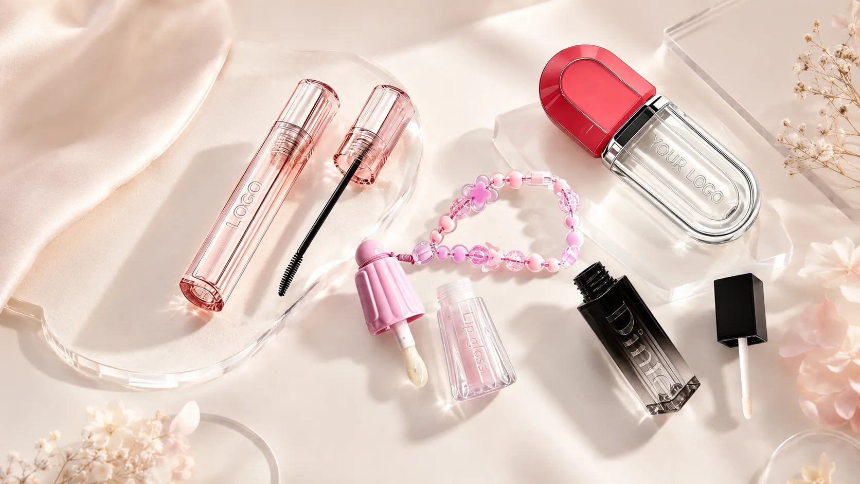
Pink routes usually deliver high emotional accessibility and fast recognition. This is why pink cosmetic containers, pink cosmetic packaging, and pink makeup packaging are effective in lip-heavy assortments. In these lines, pink lip gloss tubes, pink lip gloss packaging, pink lip gloss containers, and pink lip balm containers can build strong shelf continuity when tone progression is controlled.
For eye categories, pink mascara bottle can work as a visibility anchor, but KAIYA usually keeps surrounding eye SKUs calmer to avoid category fatigue. For complexion-related routes like foundation pink bottle or foundation pink packaging, pink can work when paired with cleaner typography and restrained finish to preserve product credibility.

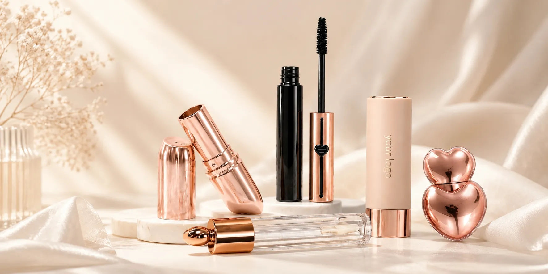
3. Rose Gold Family: Premium Warmth With Better Cross-Category Flexibility
Rose gold often performs as a balanced premium tone: richer than neutral metallics but softer than bright gold. Routes such as rose gold lipstick packaging, rose gold lipstick tube, and rose gold mascara bottle are useful when brands want elevated value cues without turning the whole line highly reflective.
KAIYA typically uses rose gold as an accent hierarchy tool. It can unify hero lip and eye products while keeping support SKUs commercially stable. This works especially well in lines that need premium expression but still prioritize readability in compact retail environments.

4. Gold Family: Hero-SKU Authority and Gift-Ready Positioning
Gold family routes, including gold cosmetic packaging, gold makeup packaging, gold lipstick tube, gold lipstick packaging, and gold lip gloss tubes, are highly effective when a brand needs immediate premium authority. Gold can also support festive or gifting programs when contrast is managed correctly.
KAIYA usually avoids full-line gold saturation. Instead, we assign gold to focal nodes: hero lipstick, selected gloss caps, or specific stick highlights such as contour stick gold packaging. This approach keeps authority high while preventing visual fatigue.

5. Black Family: Professional Stability and Long-Cycle Reorder Safety
Black families are often the most operationally stable in long lifecycle programs. Black cosmetic packaging and matte black cosmetic packaging provide strong contrast, simplify extension decisions, and support a wide range of brand tiers. In lip and eye categories, black lipstick tube, black lip gloss tubes, and black mascara bottle create a reliable base architecture.
In many programs, black performs best when paired with one accent metallic or one seasonal color family. This keeps the line structured rather than monotonous, especially when expansion into multiple formats is planned.

6. White and Silver Families: Clean Precision and Technical Clarity
White cosmetic packaging and silver makeup packaging are useful for brands that want clean-tech, clinical, or modern-minimal positioning. White can widen perceived space and cleanliness, while silver adds controlled technical premium cues. Routes like white lipstick tube, white lip gloss tubes, silver lip gloss tubes, and silver lipstick tube can all work when finish quality is tightly managed.
The main risk in white/silver lines is inconsistency visibility. Surface defects and batch shifts become easier to notice, so KAIYA usually links these routes with stricter QC windows and process discipline from development stage onward.

7. Blue and Red Families: High Memorability With Different Emotional Direction
Blue routes such as blue cosmetic packaging, blue mascara packaging, and blue lip gloss tube usually communicate cool, modern, and trend-forward energy. Red routes such as red makeup packaging, red mascara bottle, and red lip gloss tube communicate boldness and urgency. In eye clusters, these tones should still be mapped against eyebrow packaging and eyeliner packaging so color expression does not weaken precision cues. Both are high-impact families, but they should not be deployed uniformly across every SKU.
KAIYA generally recommends placing blue or red in selective category clusters where emotional direction supports product role. Overuse can cause hierarchy collapse. Controlled placement creates stronger memorability while preserving line navigation.

8. Green and Yellow Families: Niche Signals, Seasonal Use, and Accent Logic
Green cosmetic packaging and green makeup packaging can support freshness, eco-adjacent narratives, or playful lines when combined with strong structure clarity. Yellow packaged makeup and yellow lip gloss tube routes can work in seasonal campaigns or youth-led programs where optimism and visibility are strategic goals.
These families usually perform best as accent or campaign colors rather than year-round base architecture. KAIYA treats them as tactical levers inside broader stable systems.

9. Mixed Color Systems: Contrast Architecture for Multi-SKU Lines
Mixed routes such as black and gold cosmetic packaging or white and gold cosmetic packaging can be very effective when contrast roles are predefined. The practical model we use is: one base family for consistency, one accent family for authority, one bridge family for support SKUs. This keeps collection logic clear even as SKU count increases.
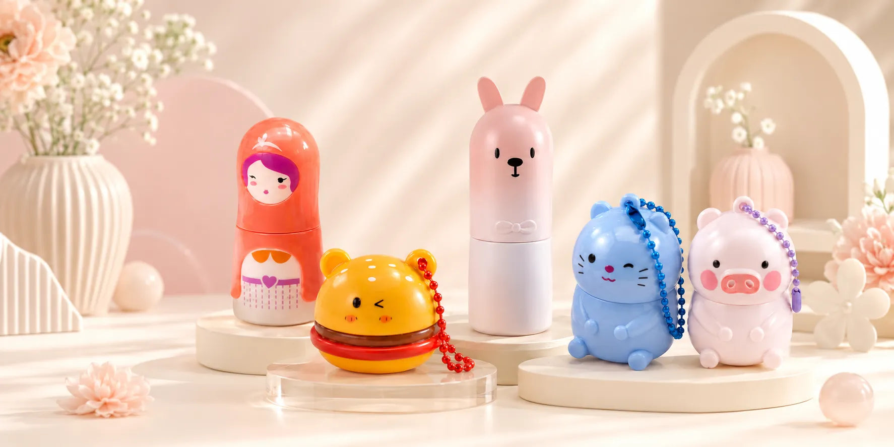
In gift and novelty sub-lines, this contrast architecture can extend to kids makeup packaging or keychain makeup packaging when those programs are connected to the main color language instead of treated as random outliers.
10. How KAIYA Executes Color Systems From Concept to Repeat Orders
Execution is where most color strategies break. KAIYA runs color development through staged controls: tone-family map, category assignment, sample calibration across multiple formats, finish confirmation, and repeat-order tolerance checks. This ensures the system remains usable across lip, eye, face, and extension SKUs.
For teams building colorful cosmetic packaging, the most practical starting point is to define color roles by business objective first, then select specific tones and categories. When role logic is clear, color becomes a conversion asset. When role logic is unclear, color becomes noise.