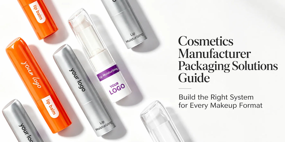
Custom lip balm packaging extends beyond the familiar twist-up tube. Depending on the formula and application method, a brand may need a solid-balm tube, a squeeze tube, a wide-mouth jar, or several coordinated formats in one product line. Each route offers different possibilities for material, shape, size, transparency, color, closure, decoration, and daily use.

KAIYA develops lip balm containers across tube and jar formats. This guide explains how to turn those existing structures into a coherent custom range—and when an original component genuinely requires new tooling.
Quick customization framework:
- Container route: twist-up tube, squeeze tube, plastic jar, or selected glass jar.
- Physical design: material, capacity, proportion, shape, cap, lid, base, and applicator.
- Visual design: transparency, component colors, logo position, surface process, and collection relationship.
- Development route: existing packaging, semi-custom decoration, or a new mold for an original component.
1. Select the Container Route Before Customizing Its Appearance
A solid balm stick normally needs a tube with a cup or platform that supports the product as it is raised. Softer balm textures may use a squeeze tube, while richer balms, lip masks, and selected textured formulas can benefit from the wider access of a jar. The formula, filling route, target capacity, and intended application method should therefore be clear before visual customization begins.

This first decision does not need to limit the collection to one format. A brand may coordinate a twist-up daily balm with a treatment jar or a softer squeeze format, but the shared design language should be built around the actual components rather than forcing every product into the same structure.
2. Customize Tube Structures Around Dispensing and Application
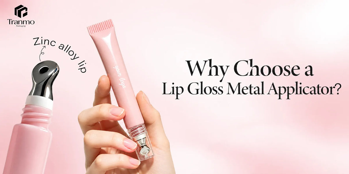
Tube customization begins with the operating structure. A classic twist-up tube can be changed through its diameter, body proportion, cup, rotating base, cap profile, and outer shell. Squeeze tubes introduce choices such as tube softness, opening size, nozzle, slanted tip, or another compatible fixed dispensing surface.

The visible design must preserve how the tube works. A taller cap needs enough internal clearance, an original base must still rotate smoothly, and a decorative outer shell cannot interfere with the mechanism or filling route. Existing components often provide enough freedom for a distinctive result without redesigning the complete internal system.
3. Customize Jars Through Opening, Lid, Capacity, and Application Details
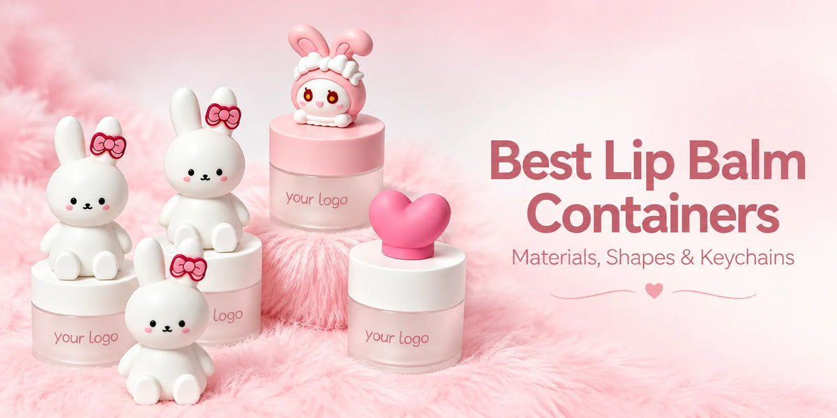
Jars create a different custom route. The wide opening makes the formula visible and easy to access, while the body-to-lid proportion strongly influences whether the product feels minimal, substantial, playful, or treatment-led. Brands can compare compact plastic jars, selected small glass jars, clear or opaque bodies, low or taller profiles, and standard or more individual shapes.

The lid deserves the same attention as the jar body. Its height, color, finish, edge profile, and logo area can carry much of the identity. Selected projects may also pair the jar with a small spatula or applicator, provided the tool size, storage method, and use route remain convenient. These choices make jar customization more than a change of artwork.

4. Material Sets Different Possibilities for Tubes and Jars
Plastic is the broadest shared material direction. It can support lightweight tubes and jars, molded colors, clear or translucent effects, standard and individual shapes, and varied closures. It is often the most flexible starting point when one lip care range needs several coordinated structures.
- Aluminum tubes: provide a genuine metal outer shell, firmer hand feel, and more defined material character. The internal cup or rotating mechanism may still use plastic components.

- Paper tubes: may use a paper-led push-up structure or a printed paper shell combined with a plastic twist mechanism. These routes differ in both material composition and operation.

- Glass jars: add weight, clarity, and a more substantial feel for selected balm or treatment projects, although they offer a different transport and handling direction from lightweight plastic jars.

Material should be chosen by structure and product intent, not by a simple premium hierarchy. KAIYA's aluminum packaging, paper lip balm tubes, and selected glass packaging each create a distinct development route.
5. Shape and Size Define the First Visual Impression
Tube proportions may be round, oval, square, slim, short, mini, or larger according to the product direction. Round tubes feel familiar, oval profiles are flatter in the hand, and square forms create clearer edges and artwork areas. Jar design can move from standard round and square containers to compact egg, ball, heart, honey-pot, fruit, or other selected silhouettes when a more recognizable product story is required.

Size should support both identity and use. Mini containers can feel portable and refined when the proportions, closure, and decoration remain precise. Larger formats create more formula capacity and visual presence. In both cases, the container must leave sufficient space for filling, opening, labeling or decoration, secondary packing, and the complete application route.
6. Transparency Determines How Much of the Formula Becomes Visible
Clear cosmetic packaging makes the balm color, texture, or remaining quantity part of the design. This is especially direct in a clear jar, while selected clear tube structures may reveal the product or internal component depending on their construction. Translucent packaging adds color and depth without exposing every detail; opaque packaging provides a continuous branding surface across different shades.
Transparency should be approved on the actual molded or glass component. Wall thickness, internal parts, parting lines, surface marks, and the filled formula can change the final result. A clean digital rendering cannot replace a physical clarity review.

7. Coordinate Color Across Bodies, Caps, Lids, and Bases
Color becomes more useful when it connects the full container family. A tube and jar do not need identical shapes to look related: they can share a cream base color, the same pink accent, a consistent black-and-gold contrast, or one repeated lid and cap color.
- White, cream, and soft neutrals: support clean or treatment-led lines and can be warmed with pale pink, beige, or muted blue.

- Pink, red, and berry shades: connect naturally with tinted balms, fruit concepts, and expressive lip collections.
- Blue and green: can support fresh, cooling, botanical, or hydration-led directions when matched to the brand concept.

- Black with gold or silver details: creates a sharper and more refined contrast across both tube caps and jar lids.
Final colors should be approved on the intended material. The same reference can appear different on transparent plastic, opaque plastic, aluminum, printed paper, or coated glass.
8. Choose Surface Processes for the Actual Component
Surface decoration should follow the material, geometry, artwork, and area to be covered. The same process will not create an identical result on a curved tube cap, a flat jar lid, a paper shell, and a real aluminum surface.
- Silk screen printing: suits clear logos, text, and selected spot-color graphics.

- Hot stamping: adds a defined foil accent to a logo, border, cap, or lid detail.
- Spray coating: can create controlled exterior color and selected matte, gloss, gradient, or tactile effects.

- Vacuum metallization: creates a reflective metal-like finish and should not be confused with choosing an actual aluminum shell.
- Laser engraving: provides an engraved detail where the material and finished surface support the intended result.
A decorated sample should show the complete combination of body, closure, color, logo, and finish. Approving each choice separately can miss conflicts in gloss level, color balance, and visual weight.
9. Use Caps, Lids, and Applicators to Complete the Product Experience
A tube cap can be longer, rounded, faceted, contrasting, or used as the main decorative feature. A jar lid can echo the tube cap through color or finish while adopting a shape better suited to the wider body. Where an applicator is included, its material, size, pickup surface, storage, and relationship to the opening should be considered as part of the package rather than as an afterthought.

These details must remain functional. Closures should open and close consistently, decorative forms should not obstruct gripping, and tools should be easy to remove, use, and return. The strongest custom result is one in which the visual detail supports the use route.
10. Decide Which Parts Need New Tooling and Approve the Complete Range
Existing lip balm containers can often be customized through material selection, capacity, molded or coated color, transparency, logo, compatible finishes, and coordinated closures. A new mold becomes relevant when the project requires an original body or jar silhouette, new cap or lid connection, different dimensions, dedicated base, or another physical component that existing tooling cannot provide.

KAIYA can support appearance and structural design, 3D rendering, rapid prototyping, DFM review, tooling, engineering trials, decorated samples, filled validation, and production preparation. Before mass production, the brand should approve the complete tube-and-jar collection rather than separate color chips or isolated components.
Share the formula types, desired container routes, target capacities, reference images, material direction, colors, transparency, decoration, quantities, and launch plan. KAIYA can then develop custom lip balm containers that work as individual products and as one coordinated line.