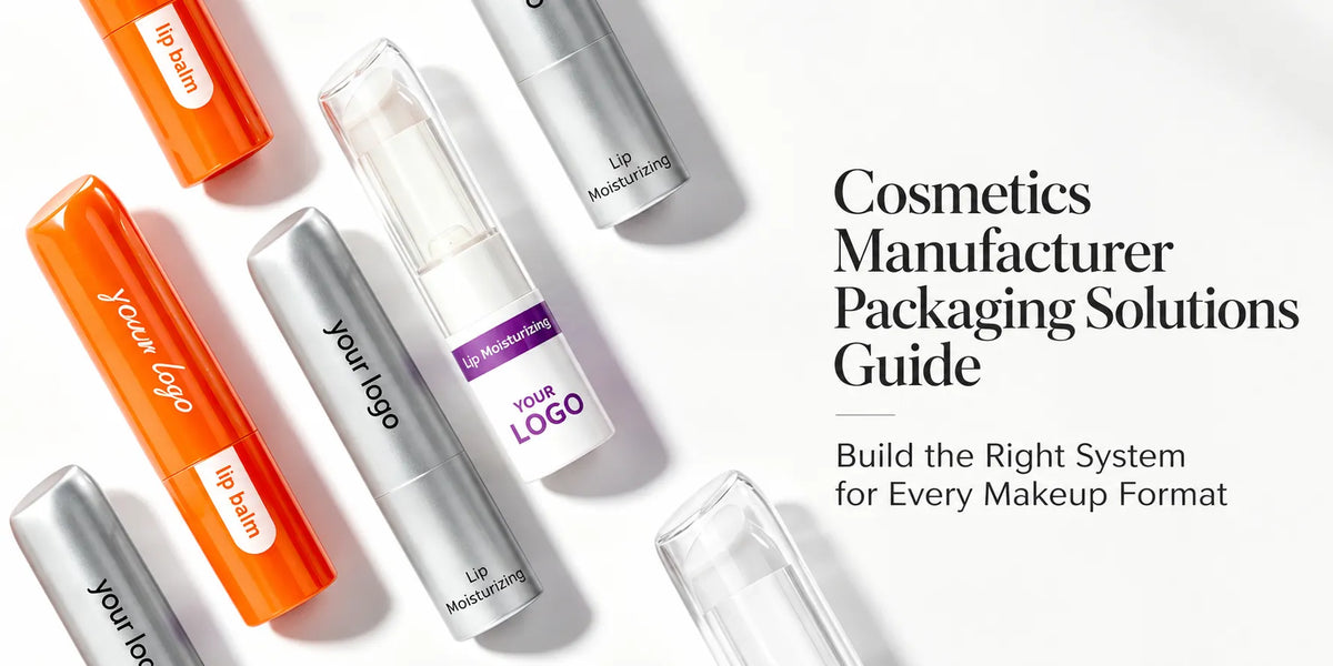
A lipstick tube, mascara container, cushion compact, and powder case should not be forced into one identical shape. They serve different formulas and application methods. A coherent collection comes from repeating selected visual rules across these different structures so customers can recognize one brand without losing the logic of each product.
This guide explains how cosmetic packaging design can connect lip, eye, and face containers through color, proportion, details, finish, and logo hierarchy. KAIYA supports category-specific primary containers and helps brands compare them side by side as one collection rather than sourcing each SKU as an unrelated project.

Quick overview:
- Category structure: keep the container suitable for its formula and application.
- Brand signatures: repeat a limited number of recognizable details.
- Color system: connect the family while preserving shade and product identification.
- Finish system: apply related surface effects with category-appropriate coverage.
- Hierarchy: let hero products stand out without disconnecting support SKUs.
Plan Your Packaging Collection
1. Start with One Brand Idea, Not One Container Shape
Before choosing individual packs, define the visual idea the collection should repeat. It may be a rounded silhouette language, a sharp geometric edge, a slim proportion, one metal-like accent, restrained typography, or a consistent relationship between the main color and the logo. Two or three strong rules are easier to carry across categories than a long list of decorative effects.

The goal is recognition, not duplication. A round lipstick cap and a rounded compact corner can belong to the same family without sharing a mold. A silver shoulder on a mascara tube can echo the ring of a lipstick and the clasp of a compact while each package keeps its own structure.
2. Preserve the Structure Each Product Category Needs
- Lip products: lipstick mechanisms, gloss wipers and applicators, balm tubes, jars, and squeeze tubes each require different internal structures.
- Eye products: mascara containers, eyeliner, brow tubes, and eyeshadow cases rely on applicators, wipers, pan layouts, mirrors, or compact closures that should not be simplified for visual matching.
- Face products: foundation bottles, sticks, cushion compacts, powder cases, and blush palettes need different dispensing, reservoir, pan, or direct-application systems.
KAIYA first organizes the line through makeup packaging by application. Once the correct structural families are known, the visual system can connect them without asking an unsuitable container to imitate another category.
Plan Your Packaging Collection
3. Use Proportion and Repeated Details to Build Family Recognition
Proportion can link structures that cannot share the same outline. A collection may use short rounded caps across lip and eye tubes, broad softly curved lids across face compacts, or one consistent balance between the visible body and the cap. Repeated corner radii, decorative rings, shoulder lines, or cap profiles create smaller points of recognition.

These details should be selected according to what each container can support. A narrow eyeliner tube has less visual space than a powder compact, so it may carry only the shared cap and logo rule. The compact can express the same idea more fully through its lid shape and accent placement.
4. Build a Color System That Works Across Lip, Eye, and Face
One master color can connect the whole line, but it does not need identical coverage on every item. A lipstick may use the color across the full shell, a mascara tube may combine it with black, and a compact may apply it only to the lid. This creates a family without making every product visually flat.
Color can also define sub-groups. Lip may use a warmer version, eye a darker version, and face a softer neutral while the logo and accent remain consistent. For multiple shades, the main package color can stay stable while a small band, label, base, or printed code identifies the SKU.

Plan Your Packaging Collection
5. Give Surface Finishes a Clear Role in the Collection
Finishes should work like a system rather than a collection of unrelated effects. Spray coating can establish the main matte, gloss, or soft-touch surface. Silk screen printing can keep logos consistent across different shapes. Hot stamping may provide one controlled metallic accent, while vacuum metallization can create a stronger reflective statement on selected components.
Coverage can change by category while the effect remains related. A hero lipstick may use more reflective detail, an eyeliner may carry a narrow accent, and a compact may repeat it at the clasp or logo. KAIYA reviews available decoration areas and helps adapt custom cosmetic containers to one visual direction without forcing every surface process onto every SKU.

Plan Your Packaging Collection
6. Keep Logo Placement and Typography Consistent
A logo system can connect a collection even when the containers vary greatly. Define the main logo version, minimum readable size, preferred orientation, and where secondary product information belongs. Vertical tubes may need a vertical or compact logo treatment, while broad lids allow a centered horizontal layout.
Consistency does not require the logo to occupy the same physical dimensions on every part. It means the visual priority remains recognizable: brand first, product name second, and shade or category information placed according to the available surface. Physical samples are important because curvature and finish can change readability.
Plan Your Packaging Collection
7. Use Hero Products and Support Products to Create Hierarchy
A collection becomes more interesting when one or two products carry the strongest design expression. A custom lipstick shape, a distinctive cushion compact, or a sculptural lip gloss cap can act as a hero. Mascara, eyeliner, or smaller support SKUs can use simpler existing structures with the same color, logo, and finish language.

This approach directs development budget toward the products that benefit most from original tooling while keeping the rest of the range coherent. It also avoids the opposite problem: one highly customized hero product surrounded by support packaging that appears to belong to another brand.
8. Review the Collection Side by Side Before Production
Individual samples may look successful but still fail as a family. Place the lip, eye, and face components together and compare color temperature, gloss level, logo scale, cap proportion, metal-like accents, and the visual weight of each package. Photograph them under consistent lighting and review both the full set and smaller category groups.
Side-by-side review also reveals where the design has been repeated too aggressively. If every package uses the same amount of gold, the result may feel heavy; if every shape is unrelated, the family may disappear. The approved collection should record shared rules and category-specific exceptions.
Plan Your Packaging Collection
9. Plan Future Categories Before Locking the First Family
Brands do not need to select every future container at the first launch, but they should test whether the design language can extend. A cap detail that works only on one lipstick mold or a finish available on only one material may be difficult to carry into eye and face categories.
A scalable system defines which elements are mandatory, which can adapt, and which belong only to a hero product. This gives later products a clear way to enter the collection without redesigning the brand identity each time.
Plan Your Packaging Collection
10. Build a Cross-Category Collection with KAIYA
KAIYA supplies lip, eye, and face primary packaging across tubes, sticks, bottles, jars, compacts, palettes, and selected special structures. We can help brands compare existing components, coordinate materials and colors, adapt logos and processes, develop hero structures, and assemble physical samples for collection-level review.
Send the planned product list, formula formats, target markets, reference mood, preferred materials, color system, logo files, finish direction, order quantities, and which products should act as heroes. KAIYA can then build a practical creative cosmetic packaging design route that keeps category function and collection identity in balance.