How to Keep a Lip Line Coherent Across Gloss, Balm, and Lipstick Packaging
A coordinated lip line does not require every product to use the same container. Lip gloss, lip balm, and lipstick have different formulas, mechanisms, and application methods, but they can still look like one collection when color, logo placement, finish, proportion, and selected design details follow a shared visual direction.

For B2B buyers, the goal is to decide which details should remain consistent and which must change with the product format. This approach keeps the collection recognizable without compromising the function of each package.
Quick planning framework:
- Shared identity: core colors, logo style, finish direction, and one or two recognizable details.
- Format fit: the correct applicator, mechanism, opening, and closure for each product.
- Visual hierarchy: which product receives the strongest decoration and which products support it.
- Family review: approve the complete group side by side rather than one package at a time.
- Repeat standard: record the approved colors, components, artwork positions, and finishes for future orders.
1. Define the Visual Signature Before Selecting Every Container
The most practical starting point is to define a main visual direction for the complete lip line. This direction gives the gloss, balm, and lipstick a recognizable family connection even when their containers use different structures. Buyers can establish that common identity through several concise rules:

- Color system: use one principal body or cap color across the collection, then introduce one controlled accent. Warm beige with rose gold can create a soft, refined direction, while clear bodies with silver and black details can feel cleaner and more modern.
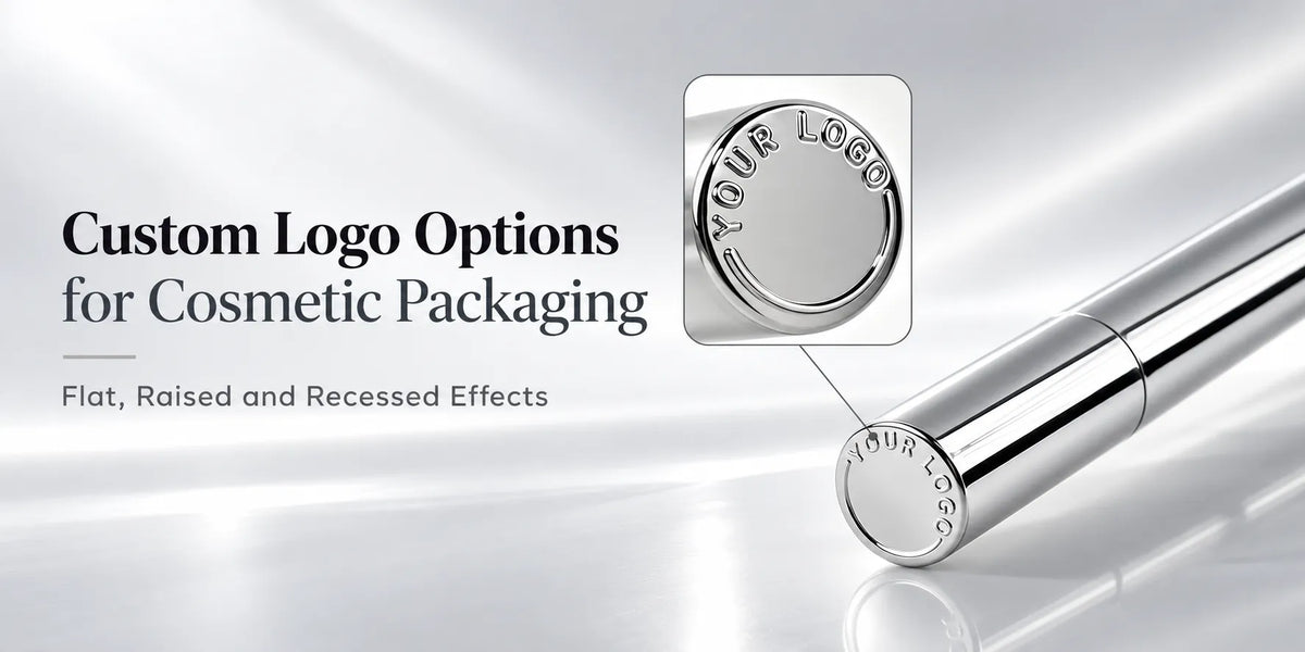
- Logo system: keep the same typeface, print color, and alignment logic. The exact Logo size may change with the available print area, but its visual position should remain related across the three products.
- Shape language: repeat one recognizable feature such as flat cap tops, softly rounded edges, or a clean square outer profile instead of requiring every container to have the same silhouette.
- Finish direction: select one main surface character—such as glossy, matte, soft-touch, or restrained metallic accents—and distribute it consistently across suitable components.
The shared signature should remain selective. Repeating the same color and logo treatment can be enough; repeating every curve, cap height, and surface effect can make the collection rigid and unnecessarily expensive. Buyers should decide which two or three details carry the brand most clearly, then allow the remaining features to respond to the product.
2. Keep Each Product in the Structure That Fits Its Formula
Visual consistency should sit on top of suitable packaging, not replace it. The three categories have different functional priorities:

- Lip gloss containers: the bottle, wiper, stem, applicator, and cap work as one dispensing system. Transparency may also become part of the design when the brand wants the gloss color or shimmer to remain visible.
- Lip balm containers: twist-up tubes, squeeze formats, jars, and selected paper tubes support different balm textures and application routes. Portability and repeated opening are often important.
- Lipstick packaging: the cup, raising mechanism, shell, and cap need to support the molded or direct-filled bullet while maintaining smooth movement and sufficient internal clearance.
A collection remains coherent when these different structures share visual cues. It becomes less credible when a visual idea forces the wrong applicator, closure, or mechanism onto a product.
3. Use Color as the Strongest Link Across the Collection
Color is usually the simplest way to connect unlike structures. The same pink, white, black, gold, or custom brand color can appear on a lip gloss cap, lip balm body, and lipstick shell even when their shapes and materials differ. A second accent color can then identify a shade family, product benefit, or launch theme.

Buyers should not assume that one color formula will look identical on every component. A color can appear brighter on an opaque plastic part, deeper beneath a gloss coating, and more reflective when combined with a metallic surface effect. Transparent gloss bottles also introduce the formula color into the collection. Side-by-side decorated samples are therefore more useful than approving each color from a separate swatch.
4. Repeat Selected Shape Details Instead of Copying the Whole Container
Small shape details can create recognition across products that cannot share the same structure. Examples include a flat cap top, a softly rounded shoulder, a narrow metallic ring, a square outer profile, or the same cap-to-body proportion. These details can be adapted to the lip gloss, balm, and lipstick formats without making the containers mechanically identical.

This method is especially useful when the line combines existing molds. A brand may not need three new packages if selected stock structures already share compatible proportions. Consistent caps, colors, and artwork can create a clear family while allowing the internal components to remain category-specific.

5. Build a Finish System That Works Across Different Components
A finish system explains how surface effects are distributed across the line. Instead of applying every process to every product, buyers can choose one main finish and one supporting detail:
- Clean and modern: opaque white or beige components with restrained silk-screen printing and one soft accent color.
- Soft and tactile: selected matte or soft-touch surfaces combined with a clear gloss bottle or localized glossy detail.
- Luxury-oriented: controlled gold, rose-gold, or silver effects on caps and selected shells, supported by simpler printing elsewhere.
- Bright and trend-led: stronger color blocking with distinctive printed graphics or localized hot stamping.

The chosen surface treatment should be tested on the real component. Material, curvature, parting lines, recessed areas, and assembly contact can all change the final result.
6. Give Hero Products More Visual Weight Without Breaking the Family
Not every SKU needs the same decoration cost or visual intensity. A hero lipstick may use a more sculpted shell or stronger metallic effect, while the matching balm uses the same color family with a simpler finish. A clear gloss bottle may keep the formula visible while repeating the lipstick cap color and logo placement.

This creates a clear product hierarchy: the hero product attracts attention, while supporting products remain recognizable as part of the same launch. It also gives buyers more control over cost because the most complex processes are concentrated where they create the strongest visual value.
7. Approve the Lip Line Side by Side
Individual samples can look correct and still feel inconsistent when grouped together. Before production, place the decorated gloss, balm, and lipstick samples in the same lighting and compare:
- body and cap colors across materials;
- logo size, position, orientation, and print contrast;
- gloss, matte, metallic, or tactile finish balance;
- cap height, visual proportion, and overall product scale;
- the amount of decoration carried by hero and supporting SKUs.

After approval, record the exact component codes, colors, artwork files, logo positions, surface processes, and approved physical samples. These references help later production and repeat orders reproduce the same collection rather than a group of merely similar packages.
8. Develop a Coordinated Lip Packaging Collection with KAIYA
KAIYA supplies lip gloss containers, lip balm containers, lipstick tubes, and broader lip care packaging. We can help brands compare suitable existing structures, coordinate colors and finishes across different components, and develop selected custom details or new molds when the collection requires stronger differentiation.
Share the planned product categories, formulas, SKU count, target colors, logo files, finish direction, order quantity, and launch schedule. KAIYA can help turn these requirements into a lip packaging family that remains visually connected while each product retains the structure it needs.